Best & Beautiful Wedding Invitation Font Pairings for 2025 (With Design Tips)
-

- June 27th, 2026
- 1,377 views

FREE SEO Topical Map Generator: Find Your Next Content Ideas
- When you open a wedding card, what’s the first thing that grabs your attention? It’s not always the flowers, paper, or gold foil — it’s usually the fonts. Typography sets the mood for your big day before anyone even reads the details.
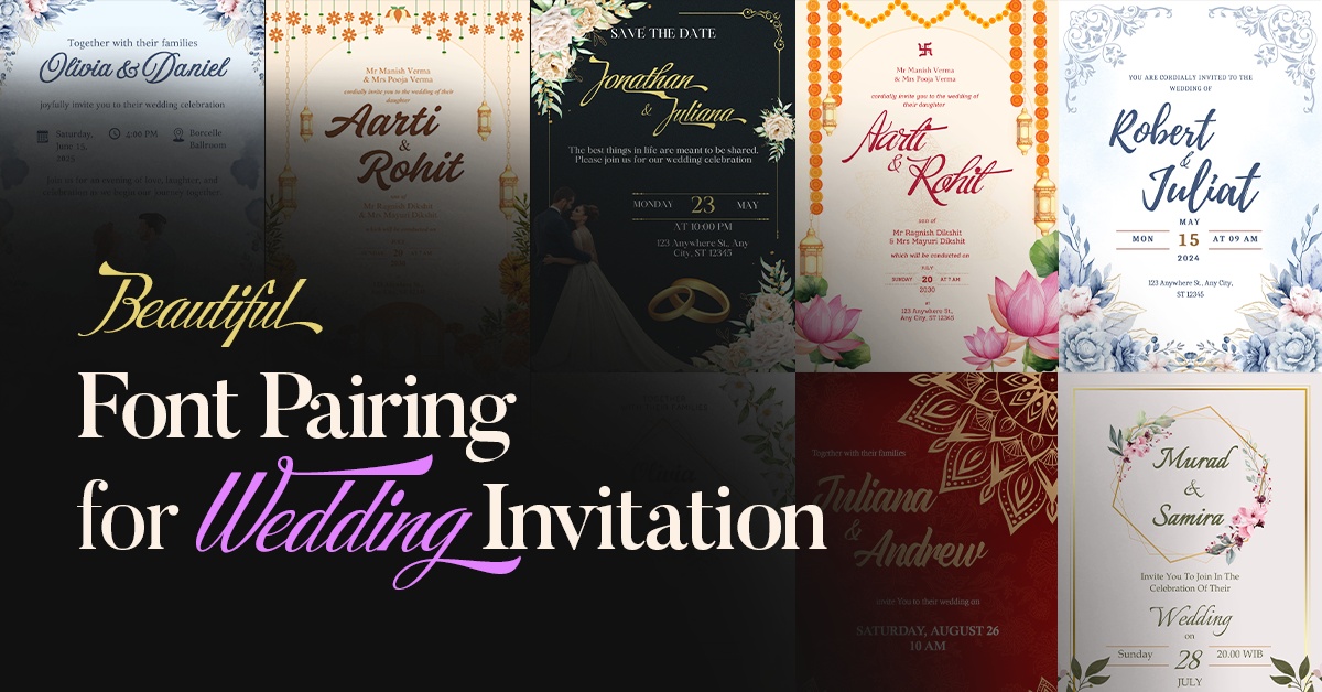
That’s why I recently curated the Best Font Pairings for Wedding Invitations 2025 on my design blog. After designing over 50 wedding cards, I’ve seen firsthand how the right font combination transforms an invitation into something elegant, timeless, and personal.
In this article, I’ll share a few of my favorite pairings to inspire you, plus tips on how to match fonts with your wedding theme. If you’d like to see all 10 curated pairings with real invitation designs and font download links, you’ll find them in my full guide.
Why Fonts Matter in Wedding Invitations
A wedding card is more than a date and venue announcement — it’s the very first impression of your celebration. Fonts set the tone immediately, telling your guests whether the day will be formal, rustic, modern, or minimal.
Pick the right font, and your invite feels sophisticated and well thought out. Pick the wrong one, and it might look outdated or unbalanced.
💡 Design Tip: Always combine your main script or handwritten font with a clean serif or sans serif. This keeps the design stylish but also readable when printed.
Sample Font Pairings for 2025
Here’s a small taste of the combinations I’ve tested and loved:
-
Praise + XB Yas → Perfect for couples who want an elegant, cultural yet modern feel.
-
Amoresa Aged + Kelvinch → A romantic vintage-inspired pairing that looks beautiful in soft, timeless invitations.
-
Playlist Script + Caladea → Casual yet elegant, this combination works well for outdoor or relaxed wedding celebrations.
-
Storefront Pro + Maharlika → A bold and luxurious duo that shines for dramatic, high-end wedding designs.
These are just four out of ten of my favorite pairings for 2025. In my full blog post, I’ve shared all 10 combinations along with real wedding card mockups so you can see exactly how they look in print.
How to Choose the Right Fonts for Your Wedding
If you’re unsure which style to pick, start by matching the fonts with your wedding theme:
- Traditional weddings → Go for elegant scripts paired with clean, formal serifs.
- Modern weddings → Choose minimal, stylish scripts with simple sans serifs.
- Cultural weddings → Use fonts inspired by heritage and pair them with balanced supporting fonts.
- Casual/outdoor weddings → Handwritten styles with light, readable serifs work best.
Quick Tips Before Finalizing Fonts
- Stick to a maximum of 2–3 fonts.
- Always test print before you finalize (some scripts look thinner on paper).
- Keep readability in mind for names, dates, and RSVP details.
Here’s a simple trick: Look at your wedding venue photos. Does the space feel formal or casual? Classic or modern? Your font combination should match that same feeling.
Final Thoughts
Fonts may seem like a small design detail, but they set the entire mood for your big day. A thoughtful pairing makes your invitations feel polished and personal, while the wrong combination can throw off the whole design.