Dark Mode, Light Mode – Which One Performs Better in Web Design?
-

- July 31st, 2025
- 45 views

Strong 8k brings an ultra-HD IPTV experience to your living room and your pocket.
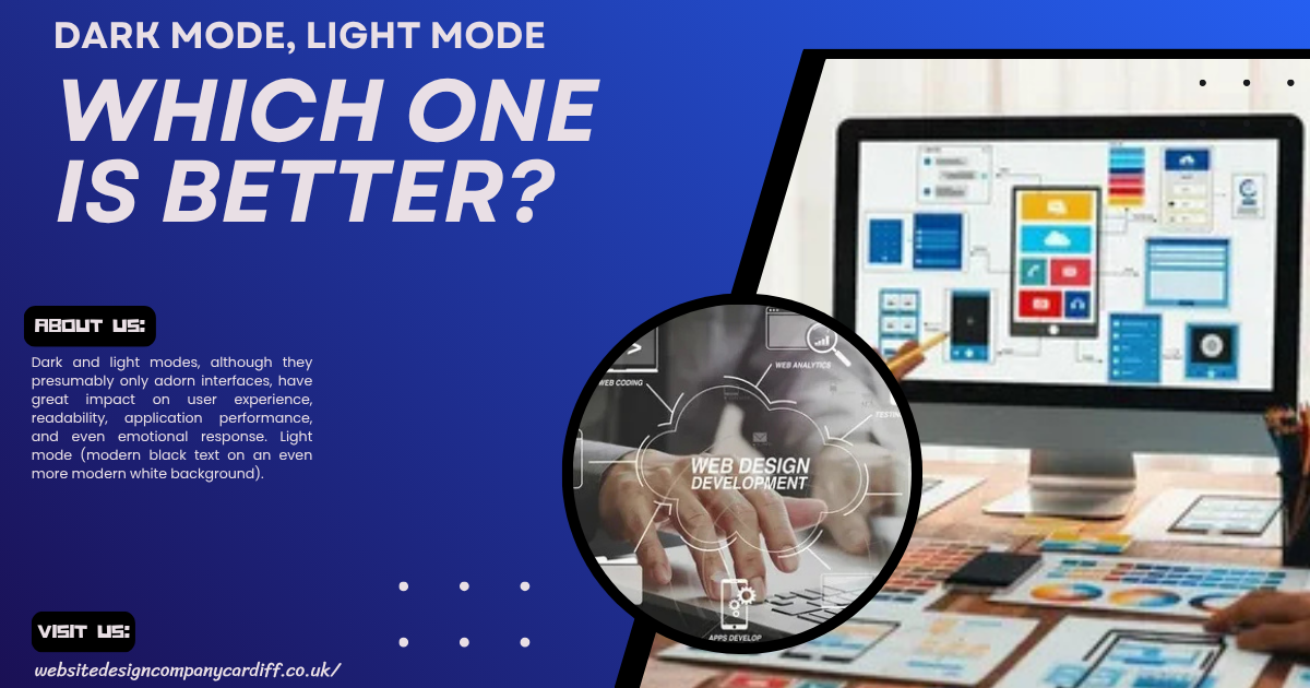
Dark and light modes, although they presumably only adorn interfaces, have great impact on user experience, readability, application performance, and even emotional response. Light mode (modern black text on an even more modern white background) is most widely adopted as it holds an air of familiarity and readability when many users work with it in bright environments. The light mode is also frequently considered to be clean, professional, and minimalism. In this way, content-heavy websites like blogs, news portals, and e-commerce platforms become clear and focused using this light mode. On the other side, though, it is not always easy on the eyes whenever a user decides to look at something at night or in lower amounts of light. Especially here, dark mode comes into play. Dark mode includes light or colored text on a dark background, reducing glare for the user, conserving battery usage on OLED screens, and generally being regarded as far more comfortable than light mode for extended viewing periods.
Here at the Website Design Company Cardiff, we argue that light versus dark isn't just a design choice; it's the choice itself. As we design websites for businesses in Cardiff and the surrounding areas, we analyze user preference versus industry standards versus brand identity to give our clients an honest recommendation based on these trends for either theme. A clientele whose brand may particularly appeal to tech-savvy millennial's, maybe in the gaming, media, or digital services industries, may rather enjoy the representation of an ultra-modern feeling in the dark-mode user interaction designs. On the other hand, industries that rely on their pristine and honest appearances, such as legal, educational, or health services, tend to prefer light mode. These are only two aspects-two of many-that we consider in our own inclusive agenda: working with the contrast for darker themes or content legibility for those lighter themes allows beauty and inclusive to thrive. We always encourage the user customization trend, thus, where applicable- both themes have been incorporated. This puts the power back in the hands of the users, and they are the creators of their own browsing experience.
A Deep Dive into the Psychology, Performance, and UX of Visual Themes
The visual theme of a website holds for a user the door into that website and this door is much farther into their psyche than they realize. Humans tend to be visual animals, and the brain processes information in a more significant way in terms of colour, contrast, brightness, and balance. The most common relationship between how something looks and what a user feels is almost automatic; in other words, it very quickly invokes an emotional response that governs whether he spends seconds around that site or bounces within seconds. For instance, a darker theme brings sophistication, mystery, or exclusivity, hence its use in industries such as luxury fashion, technology, and entertainment. These kinds of themes are usually sleek and modern, and they may innocuously convince users to think of a brand as more innovative or premium. Lighter themes, in general, feel airy, clean, and approachable, and as such, are more effective in industries that require trust and have a need for clarity, such as healthcare, education, or legal services. It also affects beyond colour as far as layout and spacing are concerned. It makes a presentation very comfortable and, indeed, usable. In contrast, broken, poorly aligned, or very bright-coloured combinations create clutter and impinge on someone's cognitive processing to mental friction that creates discomfort.
The performance of a site along with the User Experience would most likely be directly affected by the visual theme of the site. While performance is so much about technicalities e.g. the optimization of images, the cleanness or overall thing about the code, the visual theme can either support or sabotage these efforts. Like, using dark themes on OLED or AMOLED displays consumes way less battery at the same time compared to using light ones. It's really good to go for mobile users, especially those who consider power usage or are on the Internet for long times. Performance from a point of view of UX is not only about speed of loading; it also refers to how fast and smooth an end-user will be able to do the intended action. Clear visibility to buttons, a sensible colour coding scheme, and smooth transitions are the elements a theme needs to provide for seamless navigation, which is an index of great UX. There is not one "best" visual theme because of the subjective nature of user preference, in addition to the fact that these preferences differ widely on all demographic lines, by propensity, and even environment. Browsing in a dimly lit room might make a user favor reduced eye strain.
Exploring User Preferences, Accessibility, and Design Trends in 2025
In the year 2025, user preferences have been changing quite rapidly, and advances in technology along with the advancement in awareness of digital wellness and increasing anticipation of very personalized online experiences have all worked towards this direction. The modern user now believes that the sites should not be static and this one-size-all becomes evoked by adaptive well-intended intuitive designs that interact not only upon context but also behavior. This aspect becomes even more evident for younger users, who are used to quasi-app-like interfaces, scrolling experiences that can be described as immersive, and then real interaction. They want smooth animations, clean navigation, and responsiveness, but they also want options, like theme toggles, text scaling and modular layouts. As it has always been, the increasing rise of generative AIs and machine learning adds background to design expectations, and now users are demanding unique delivery of content based on past interactions on browsing history or at times even a time of day. On the margins, minimalist demand hasn't died down. In fact, it's changed. Minimalism today's usage in 2025 is that of layered depth, micro-interactions, and thoughtful white-space-they truly feel elegant and alive- instead of flat and stripped-down.
Previously treated as an afterthought, accessibility is now rightly one of the main pillars of the web design arena. Designs for accessibility by 2025 will no longer be restricted to screen readers or contrast ratios but rather the large envelope of ways any different user interacts: keyboard navigation, voice commands, haptic feedback, and even augmented-reality elements responding to a user's movement. Nowadays, design systems have accessibility presets built-in to help designers craft compliant interfaces without taking away from their creativity. Accessibility audits have entered the realm of standard operating procedures among a professional developer's workflow, while new tools look toward using AI to catch any potential problems in the design stage in real time. More importantly, though, designers are beginning to view accessibility as an opportunity rather than a limitation-that is to say, as a way to broaden audience reach, spotlight their message, and deliver an even greater UX for their entire audience. Inclusion is finally becoming a huge topic of discussion in design itself. Ignoring it is seen as a sign of recklessness-bauble-and considered constantly out-of-touch.
What Designers and Users Need to Know About Light vs Dark UI Choices
Light and dark UI themes are not just trends. They are more like the aspects of psychology, usability, culture, and accessibility. A light UI, designed primarily with black text on a white background or vice versa, has traditionally been the overwhelming choice for the digital arena, mainly for its readability. Most users find higher contrast text easy to read against a bright background, especially with glaring sunlight. Because of its neutrality and feedback familiarity, the light theme is applied widely to apps with clear intent or heavy information drainers, such as news sites, e-learning sites, and corporate portals. It is in line with patterns set into the users' minds after so many years of working with paper and print, where the role of white spaces was to guide focus and ease visual fatigue. However, one disadvantage of the light user interface is its brightness, rendering it quite uncomfortable under low-light conditions, particularly during the night, thereby straining the eyes with prolonged viewing. Since then, Dark UI is all the rage as it brings a rather modern picturesque look and energy conservation on OLED. From a UX view, the decision-making for light and dark UIs isn't about eye-candy or brand. It's about answering user requirements and the use case and the environmental context.
Questions should be asked by designers: when and how is he using that product? For example, in the case of daily use of the application or the website to perform tasks during the day such as reading or shopping or research, the light UI might have been the most accessible and functional interface. Using it in dark environments, for instance music production software, gaming dashboards, or code editors, well-structured dark UI can improve usability or reduce discomfort. One of the most important changes in UI design today is adaptability, and this trend is increasing above all with users' e interface such that, in the near future, most will not have to rely on direct change in adapting either through switch between light and dark themes or the system adjusts according to illumination or systems preference. Users should also make them understand that those can affect their comfort and productivity by the theme that they choose. For example, if a user stays a long time working on a particular platform, it at times shows how badly they know tests. It will encourage a user to save his work in light mode where possible but use dark mode to encourage productivity and clarity as tasks at hand increase.
The Aesthetics, Functionality, and Science Behind Modern Website Themes
Current web design is somewhere between visual storytelling and user perceptions, occupying that territory along psychological lines of online decision-making. Shifts in aesthetics have moved from flat, one-dimensional layouts to dynamic, immersive works infused with motion, depth, and layered interactivity. Designers now select combinations of colors, typefaces, and atmospheric considerations. From the lightest gradients to minimalism to the boldest of brutal compositions, contrasting palettes and energetic typography, every aspect goes toward setting the right ambiance for the brand or messaging. Aesthetics are typically the first thing a user notices about a theme, and that first impression can be established in milliseconds and affect the rest of the user's journey. The user might distrust or disengage from the theme at once if it looks outdated and cluttered, whereas a fresh and uncluttered interface will build subtle cues of professionalism, creativity, and trustworthiness so that the user is unconsciously pulled onwards. The visual impact is not by chance; it's based on neuroscience and behavioral psychology. Colors affect moods and cognitive thought, creating connections that trigger these feelings. For instance, blue seems calm and peaceful, but messy reds create romance and subconscious anger.
On the other side, functionality speaks to the how well a theme interacts with practical, everyday user engagement — the point where form meets function. A theme may look fabulous on the drawing board, but if it happens to be slow, does not scale across devices, or gets in the way of core functionality, it is completely useless. A contemporary website theme should, by default, be responsive, elegantly scaling to all screen sizes while maintaining visible integrity. Navigation should be intuitive, for the desktop, tablet, and mobile. Load time, interactivity, and structure have long since transcended back-end matters to become intrinsic to front-end experience. Any site that graciously suffers from inertia in loading, despite its beautiful design, would not be far from raising a high bounce rate. Performance optimization is often the most inconspicuous yet paramount part of the design process: clean code, image compression, strategies for loading fonts, and modular CSS frameworks combine their efforts together for the benefit of speed and functionality of a theme. Equally important, any accessibility features, such as keyboard navigation, ARIA labels, and high-contrast options, must be at the core of the theme from day one and not added as an afterthought.
The science behind this is also evolving quite rapidly.
Note: IndiBlogHub features both user-submitted and editorial content. We do not verify third-party contributions. Read our Disclaimer and Privacy Policyfor details.