How to Optimise Your Website for Mobile SEO: Best Practices for 2025
-

- August 23rd, 2025
- 463 views

Get a free topical map and start building content authority today.
It’s 2025, and if your website still isn’t fully optimized for mobile users, you’re not just missing out… you’re falling behind.
With over **70% of global web traffic coming from mobile devices**, mobile SEO isn’t just “nice to have” it’s essential. Whether you’re running an eCommerce site, a local business, or a blog, Google’s mobile-first indexing means **your mobile site is your primary site** in the eyes of search engines.
So, how do you make sure your site is not only mobile-friendly but fully optimized for **mobile SEO** in 2025? Let’s break it down in a way that’s easy to follow, even if you’re not a tech expert.
## ☝️ First, What is Mobile SEO?
**Mobile SEO** is the practice of optimizing your website so that it functions properly and provides a great user experience on mobile devices while also helping you rank well in search results.
It’s not just about responsive design. Mobile SEO involves:
- Fast loading times
- Easy navigation on small screens
- Clear content structure
- Optimized images and media
- Mobile-friendly page layouts
- Voice search compatibility
---
## ✅ Why Mobile SEO Still Matters in 2025
Here’s the thing—Google made **mobile-first indexing** standard back in 2020. That means Google now crawls and indexes the *mobile version* of your site first, not your desktop site.
If your mobile version is slow, clunky, or missing important content, your rankings will suffer—plain and simple.
Also:
- Mobile searches dominate (especially for local intent like “restaurants near me”).
- Mobile users are more impatient they bounce quickly if things don't load or display well.
- Google’s **Core Web Vitals** focus heavily on mobile performance.
---
## 📲 1. Make Sure Your Site is Mobile-Responsive
A responsive design automatically adjusts to different screen sizes, whether someone’s on an iPhone, Android, tablet, or foldable device.
### ✅ Best Practices:
- Use flexible grids and layouts (CSS Grid or Flexbox).
- Avoid fixed-width elements.
- Design for thumbs not mouse pointers.
- Test your site on real mobile devices (not just simulators!).
🛠 **Tools to try**:
- [Google’s Mobile-Friendly Test](https://search.google.com/test/mobile-friendly)
- Browser dev tools’ responsive view
---
## ⚡ 2. Speed Is King: Optimise for Mobile Page Load Time
Mobile users are **impatient** and Google knows it. Slow websites don’t just frustrate visitors; they *kill* conversions and rankings.
### ✅ How to Speed Things Up:
- **Compress images** (use WebP format where possible).
- **Minify** HTML, CSS, and JavaScript.
- **Use lazy loading** for images/videos below the fold.
- **Avoid render-blocking resources**.
- **Leverage browser caching and CDNs**.
🛠 **Tool Tip**:
Use [Google PageSpeed Insights](https://pagespeed.web.dev/) to get specific mobile performance tips.
---
## ✍️ 3. Optimise Your Mobile Content for Readability
Mobile screens are small. That means your content needs to be:
- Easy to read
- Easy to scroll
- Easy to digest
### ✅ Mobile Content Tips:
- Use **short paragraphs** (2–4 lines max).
- Use **bullet points** and **subheadings**.
- Avoid large blocks of text.
- Increase font size for readability (16px is usually a good base).
🎯 Pro Tip: Use clear CTAs (call-to-actions) with big, tappable buttons.
---
## 🎯 4. Master Mobile Keyword Strategy (Think Voice + Local)
More people are using **voice search** on their phones (think Siri, Google Assistant). These queries are often:
- Longer
- More conversational
- Location-based
### ✅ How to Adapt:
- Optimise for **question-based** keywords (e.g., “how do I find…”).
- Use **long-tail** keywords.
- Add **FAQ sections** with natural-sounding answers.
- Include your **business location** and **local terms** in content.
💬 Example: Instead of just “best cafes,” go for “best organic cafes in Brisbane near South Bank.”
---
## 🔗 5. Optimise Internal Linking for Mobile UX
Too many links packed closely together? That’s a no-go on mobile.
### ✅ Mobile-Friendly Linking Tips:
- Space out links so users can easily tap them.
- Avoid tiny anchor text links.
- Make sure important internal pages are reachable in 2–3 taps.
Use breadcrumbs, simplified menus, and intuitive layouts to help with navigation.
---
## 🧩 6. Mobile Navigation & UX: Keep It Simple
Great mobile SEO is also about **user experience**. If users can't find what they’re looking for quickly, they’ll bounce.
### ✅ UX Best Practices:
- Use a **hamburger menu** for navigation.
- Limit navigation to 4–6 top-level items.
- Make CTA buttons large and centered.
- Avoid intrusive popups (Google penalizes these on mobile).
- Always include a search bar.
🎯 Bonus: Implement **sticky headers** for faster access to menus or contact options.
---
## 🧠 7. Implement Structured Data (Schema Markup)
Even on mobile, Google uses **structured data** to enhance how your pages appear in search results.
### ✅ Add Schema for:
- Local business info
- Reviews and ratings
- Products and pricing
- FAQs
- Events
🛠 Use [Google’s Rich Results Test](https://search.google.com/test/rich-results) to validate your schema.
---
## 📍 8. Optimise for Local Mobile SEO
Mobile users are constantly searching for:
- "Near me" services
- Store hours
- Directions
- Contact info
If you're a local business, mobile optimization *must* include **local SEO elements**.
### ✅ Local Mobile SEO Tips:
- Claim and verify your **Google Business Profile**.
- Add **local keywords** throughout your site.
- Include **NAP** (Name, Address, Phone number) in the footer.
- Use location schema markup.
- Encourage mobile-friendly **review generation**.
---
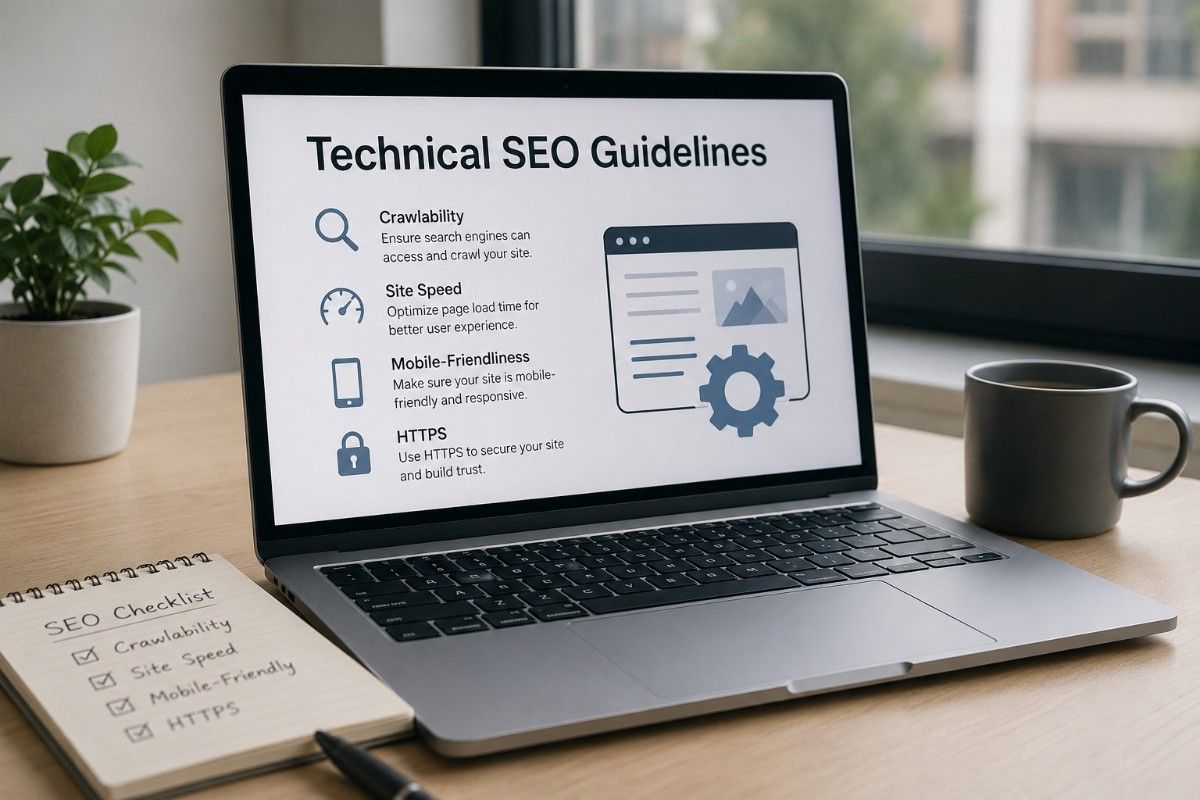
## 🔐 9. Secure Your Mobile Site with HTTPS
This one’s simple. Google won’t rank unsecured (HTTP) sites well. Users also hesitate to browse or shop on them.
👉 Make sure your site is **fully HTTPS-secured**, with a valid SSL certificate.
---
## 🧪 10. Test EVERYTHING on Mobile
Don’t assume it “probably works.” Test your site across:
- Android and iOS
- Different browsers (Chrome, Safari, Firefox)
- Multiple screen sizes
Use tools like:
- Google Search Console’s **Mobile Usability** reports
- Chrome DevTools
- BrowserStack or real devices
---
## 🚀 Final Thoughts: Mobile SEO Is Your SEO
In 2025, mobile SEO isn’t just part of SEO—it *is* SEO. Every decision you make—from design to content to performance—should consider mobile users first.
Start small:
- Check your mobile site speed
- Simplify your layout
- Optimize key pages and images
- Build a mobile-first content strategy
By focusing on **real user experience** and search engine best practices, you'll boost your rankings, lower your bounce rates, and turn more mobile visitors into happy customers.
---
**Need help with Mobile SEO or web performance?**
Agencies like [GlobalGenie.com.au] offer expert services in website design, SEO, and mobile performance optimization—especially for businesses across Australia.


