Best Neon Sign Fonts: Boost Visibility and Design Impact
-
- February 23rd, 2026
- 1,373 views

Get a free topical map and start building content authority today.
Choosing the right neon sign font affects both readability and brand personality. A clear neon sign font improves visibility from a distance, reduces ambiguity in letter shapes, and enhances the intended aesthetic—whether retro script or bold sans-serif.
- Prioritize legibility: stroke width, x-height, spacing, and contrast.
- Match style to context: script for mood, sans-serif for clarity, decorative sparingly.
- Consider viewing distance, mounting height, and local sign codes.
- Test at actual scale and lighting conditions before finalizing design.
Neon sign font: key visual factors that affect readability
A neon sign font must account for how light behaves when shaped into tubing or LED modules. Factors that influence readability include stroke width (tube diameter), x-height (the height of lowercase letters), character spacing (kerning and tracking), stroke contrast, and the presence of closed counters (examples: "a", "e", "o"). High-contrast color choices and appropriate letterspacing reduce the risk of letters appearing to merge when illuminated.
Stroke width and tube geometry
Thicker strokes can increase legibility at long distances because they produce stronger luminance and reduce the chance of break-up in the letterform. However, overly thick strokes can make counters collapse and reduce differentiation between characters. When converting a font to neon tubing, work with a fabricator to confirm acceptable tube bend radii and minimum stroke widths.
Letterforms: serif, sans-serif, and script
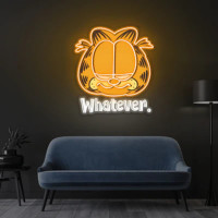
Sans-serif fonts are generally clearer for neon signage because they avoid small terminals that can blur when lit. Script and cursive styles can be visually appealing but require generous spacing and simplified letterforms to prevent loops from joining when illuminated. If a decorative or script look is desired, select designs specifically adapted for signage or simplified manually for tubing.
Case, capitalization, and spacing
All-caps designs increase uniformity and often improve legibility at a glance, but mixed-case text with a higher x-height is easier to read in longer phrases. Adjust kerning and add deliberate gaps in neon tubing to maintain separation between strokes where letters could otherwise connect. For short messages or brand names, carefully crafted lowercase shapes can enhance recognition while remaining readable.
Practical considerations: viewing distance, lighting, and materials
Viewing distance and letter size
Estimate typical viewing distance to determine minimum letter height and stroke thickness. A common rule for signage is that each inch of letter height provides legibility for several feet of viewing distance, but exact requirements depend on site conditions. For storefronts, larger letter heights are needed for street visibility; for indoor displays, reduce sizes accordingly but always test at full scale.
Ambient lighting and color contrast
Contrast between the illuminated letters and the background improves recognition. Cool colors can appear dimmer than warm colors at the same luminance due to human visual response. For universal design principles and color contrast guidance, review accessibility and contrast standards such as the W3C Web Content Accessibility Guidelines (WCAG) for insights on contrast and readability across environments: W3C WCAG. While WCAG is focused on digital content, its guidance on contrast ratios and legibility can inform good practices for physical signage as well.
Material and fabrication constraints
Traditional glass neon allows continuous flowing strokes but requires experienced bending for tight curves. LED neon alternatives offer flexible channel modules with different limits on bends and segmentation. Discuss minimum bend radii, connector locations, and maintenance access with the fabricator to ensure the chosen font can be produced without compromising letterforms.
Design tips for choosing a neon sign font
Start with a legible family and test at scale
Select a font family known for clean, open letterforms as the starting point. Create full-scale mockups and view them from likely vantage points and under relevant lighting. Simulate nighttime and daytime conditions. Physical or life-size digital mockups reduce the chance of surprises after fabrication.
Simplify and customize for tubing
Many fonts require modification before becoming neon. Remove extraneous terminals, widen counters, and introduce separation points to prevent unintended joins. Work with a designer or sign maker experienced in translating fonts to neon or LED channel letters to preserve both legibility and desired style.
Balance branding and legibility
Brand identity matters, but legibility should not be sacrificed for style when the message must be readable. Consider pairing a decorative logotype in a small area with a clearer supporting typeface for essential information such as hours or directions.
Regulations and safety
Local sign codes and building regulations often dictate maximum sign area, illumination levels, permitted colors, and mounting requirements. Consult municipal sign regulations and, when necessary, the local permitting authority or a licensed sign contractor to confirm compliance. Electrical and safety standards for illuminated signs also vary by jurisdiction and should be followed to reduce risk and ensure longevity.
Testing and maintenance
After installation, test readability under various conditions: full daylight, twilight, and nighttime. Check for uneven brightness, color shifts, or unexpected glare. Plan for periodic maintenance: tube replacement, driver checks for LED, and cleaning to maintain optimal visibility over time.
Frequently asked questions
What is the best neon sign font for legibility?
Fonts with high x-height, uniform stroke widths, open counters, and minimal decorative terminals tend to be the most legible for neon signage. Sans-serif styles adapted for signage often perform well. Testing at full scale is essential.
Can script fonts work for a neon sign font?
Script fonts can work for short words or logos when simplified for tubing; avoid tightly looping scripts for longer phrases because illuminated strokes can blend. Ensure adequate spacing and test in the intended environment.
How does viewing distance affect the chosen neon sign font?
Viewing distance determines minimum letter height and stroke thickness. Longer distances require larger letters and bolder strokes to maintain legibility; estimate typical viewer vantage points when selecting font size and style.
Do local codes limit font choices or design elements?
Local sign codes typically regulate size, placement, illumination, and sometimes color or animation rather than specific fonts. Verify local regulations and permit requirements before finalizing design.