From Colour Forecast to Finished Garment: How Fabric Choice Changes the Final Shade
-
- Published Updated
- 105 views
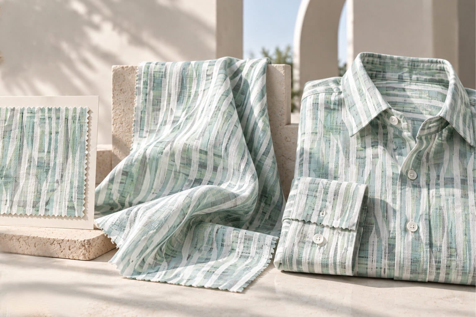
A colour forecast can tell you what shades are likely to influence the next season. It can give a collection its direction, help shape a mood board and guide early design decisions. Yet the colour on a forecast board is only the beginning.
Once that colour meets fabric, it starts to change.
The same shade can look crisp and bright on one fabric, soft and muted on another or deeper and richer on a third. For garment manufacturers, this is an important part of turning a colour trend into a finished collection. The fabric you choose has a direct influence on how the final colour is perceived.
Cotton Gives Colour a Clean, Versatile Base
Cotton is one of the most widely used fabrics in shirting and its versatility makes it a reliable starting point for colour development. However, not every cotton fabric presents colour in exactly the same way.
A smooth, finely woven cotton can give a shade a clean and defined appearance. Finer cottons can also create a polished surface where subtle colour differences are easier to notice. A denser weave, on the other hand, can give a colour greater visual depth.
The construction matters too. A crisp cotton poplin, for instance, can make a colour appear sharper, while a softer cotton construction may give the same shade a more relaxed character.
This is why a colour reference should always be considered alongside the specific cotton fabric being used for production.
Linen Brings Texture into the Picture
Linen has a very different visual character. Its natural texture, surface variation and characteristic slubs interact with light, giving colours a softer and more organic appearance.
A shade that looks highly saturated on a smooth cotton may appear slightly more nuanced on linen. This does not make the colour less attractive. It gives it a different personality.
For collections built around natural, relaxed or understated colour palettes, this quality can be particularly useful. The fabric becomes part of the colour story rather than simply serving as a base for it.
Blends Can Create Their Own Colour Character
Cotton-linen blends offer another dimension. When different fibres come together, the resulting fabric can have a colour appearance that differs from either fibre used individually.
The proportion of each fibre, along with the fabric construction and finish, can influence how the final shade looks. This is worth considering when a collection needs the visual appeal of one fabric while retaining some of the qualities of another.
For manufacturers, it means that approving a colour on pure cotton does not necessarily guarantee the same visual result when the same colour is developed on a cotton-linen fabric.
Fabric Weight and Construction Matter
Colour is also affected by how much fabric there is between the viewer and the light.
A lightweight shirting fabric can create a lighter visual impression, while a heavier construction may make a shade appear more substantial. The weave itself also influences how light reflects from the surface.
This becomes particularly important when developing several styles in the same colour family. A brand may want one consistent colour story across shirts made from different fabrics, but the finished garments may naturally show subtle variations.
That is why colour consistency should be approached as a fabric-specific process rather than a single reference that applies identically to every material.
From Colour Reference to Fabric Swatch
For manufacturers, one of the most useful steps is to move from a digital or printed colour reference to the actual fabric as early as possible.
A physical swatch gives designers and sourcing teams a much clearer idea of how the shade behaves on the intended material. It allows them to assess the colour alongside the fabric’s texture, weight, weave and finish before committing to bulk production.
This is especially important when working with seasonal colours. A forecast may identify the shade consumers are expected to respond to, but the fabric determines how that shade will be experienced on the finished garment.
The Right Fabric Makes the Colour Work
Choosing a colour is one decision. Choosing the right fabric to express it is another.
Cotton can provide a clean and versatile canvas. Linen can bring softness and natural texture. Blends can create a different balance of appearance and performance. Even variations in weave and weight can change the way the same colour is perceived.
For garment manufacturers, the strongest results come from considering these elements together from the beginning.
At Cirocco Fabrics, a broad selection of cotton and linen shirting fabrics gives manufacturers the flexibility to consider colour alongside the qualities of the fabric itself. From superfine cotton to Egyptian and Supima cotton and linen options, the right base can help a forecasted colour translate into a finished garment with the character the collection demands.
A colour trend may set the direction, but fabric is what brings it to life.