How Mobile-First Design Can Elevate Your Brand?
-

- December 07th, 2025
- 1,564 views

In today’s digital world, most people use their smartphones to browse the internet. Whether they are shopping, reading news, or looking for information, mobile devices are their go-to choice. That’s why businesses must focus on mobile-first design to make sure their websites are easy to use on small screens. A good mobile-friendly website helps improve user experience, increases traffic, and boosts brand credibility.
What is Mobile-First Design?
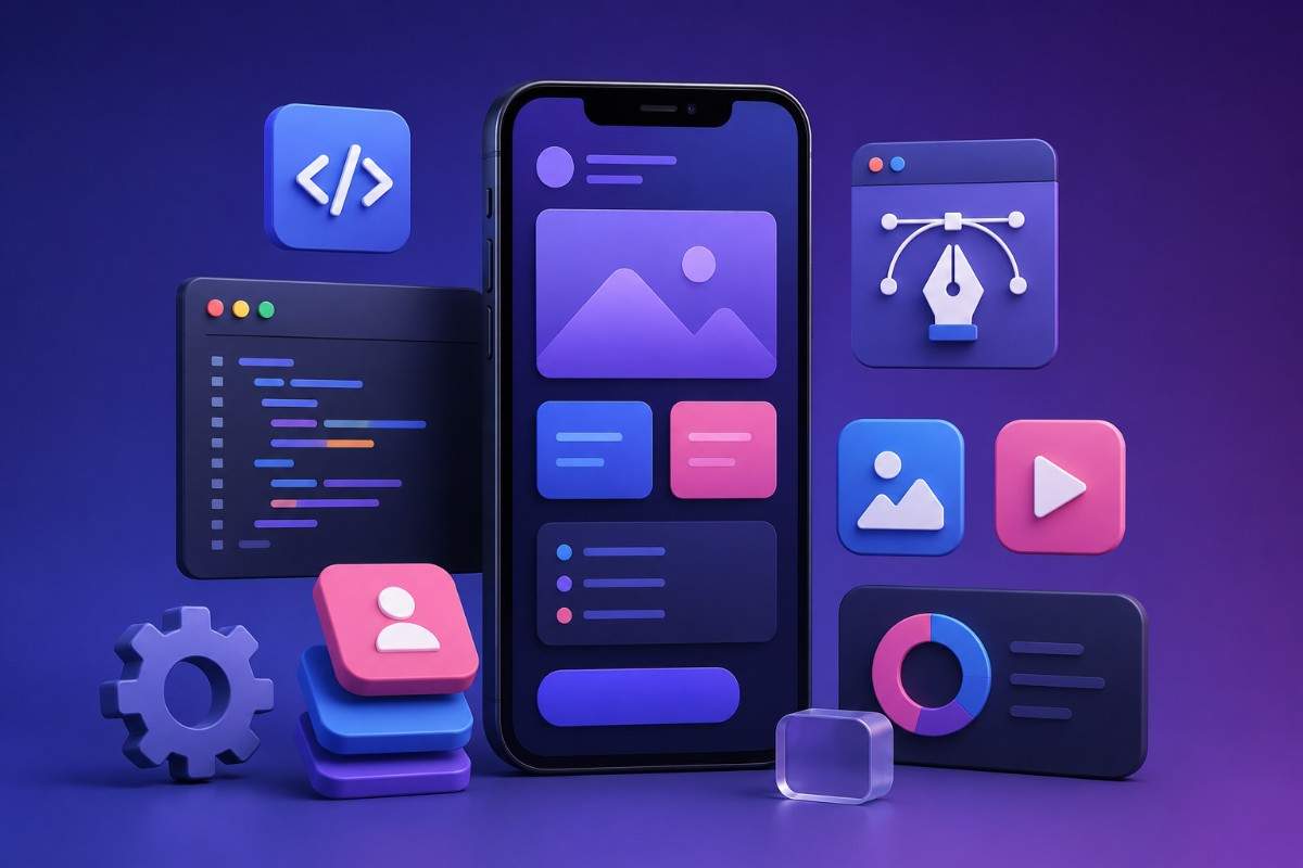
Mobile-first design means creating a website with mobile users in mind first before making adjustments for larger screens like tablets and desktops. This approach ensures that the website is responsive, loads quickly, and provides a smooth experience on all devices. Since more than half of web traffic comes from mobile phones, businesses cannot afford to ignore mobile-first design.
Why is Mobile-First Design Important?
1. Improves User Experience
A website designed for mobile makes it easy for users to navigate, read content, and find what they need without zooming in or scrolling too much. A smooth user experience keeps visitors on your site longer, reducing bounce rates and increasing conversions.
2. Boosts Search Engine Rankings
Search engines like Google prioritize mobile-friendly websites in search results. This means a mobile-optimized website is more likely to appear at the top of search results, driving more organic traffic to your business.
3. Faster Loading Speed
Mobile-first websites are designed to load quickly because mobile users expect instant access to information. Slow-loading sites drive users away, while fast websites keep them engaged and encourage them to explore more pages.
4. Better Conversion Rates
When visitors find a website that is easy to use on their phones, they are more likely to take action, whether it’s signing up for a newsletter, making a purchase, or contacting your business. A mobile-first design improves call-to-action (CTA) effectiveness.
5. Increases Brand Credibility
A professional, mobile-friendly website makes your brand look more trustworthy. If users struggle to navigate your site on their phones, they may lose trust and choose a competitor instead. A well-designed website helps build brand reputation and customer loyalty.
How to Implement Mobile-First Design
1. Use a Responsive Layout
A responsive design adapts to different screen sizes, ensuring a consistent experience across devices. Websites should adjust automatically to fit mobile, tablet, and desktop screens without losing functionality.
2. Prioritize Simple Navigation
Menus should be easy to access and use on mobile screens. A simple navigation bar with clear categories and a search function helps users find what they need quickly.
3. Optimize Page Speed
Fast loading times are crucial for mobile users. Optimizing images, using compressed files, and reducing unnecessary code can improve website speed.
4. Ensure Readable Text and Accessible Buttons
Text should be large enough to read without zooming in, and buttons should be big enough for users to tap easily. This prevents frustration and improves user engagement.
5. Use Mobile-Friendly Forms
If your website has contact forms or sign-up pages, ensure they are easy to fill out on mobile devices. Avoid long forms and unnecessary fields that make the process difficult for users.
6. Test on Multiple Devices
Before launching your website, test it on different smartphones and tablets to ensure it looks good and works well everywhere. Tools like Google’s Mobile-Friendly Test can help identify areas for improvement.
How Mobile-First Design Helps Local Businesses
If you own a local business, having a mobile-first website is essential. Most people search for local businesses on their phones before visiting a store. A well-designed mobile website increases the chances of users contacting you or visiting your business location.
For example, if you run a web design business, having a mobile-optimized site helps potential customers find your services easily. If you are looking for professional website solutions, Web Design Mississauga can help you create a mobile-friendly website that attracts more customers and improves business growth.
Conclusion
Mobile-first design is no longer an option—it’s a necessity. A well-optimized mobile website improves user experience, boosts search rankings, increases conversion rates, and strengthens brand credibility. Businesses that embrace this approach will stay ahead of the competition and attract more customers. If you want to build a professional, mobile-friendly website, consider working with experts like Web Design Mississauga to enhance your online presence and grow your brand.


