 Local SEO Boost – Put Your Business on the Local Map!
Indoor Signage for Offices: How to Keep Your Workspace Functional and Stylish
Written by Signs Depot » Updated on: June 17th, 2025

Indoor Signs in Mississauga is the quiet MVP of workplace design. It’s the unsung hero that keeps your team from wandering into the supply closet during a fire drill and the style whisperer that subtly tells visitors, “Yeah, we’ve got our act together.” But how do you balance practicality with attractive designs? Don't worry; we have got you covered. In this article, we’re diving into the art of crafting indoor signage that is a mix of cool and effective.
Prior to choosing fonts or arguing about bright colors, keep in mind that nothing else matters if your signage does not work. Thus, these are the basics that you need to understand for making effective signage:
1. Prioritize Clarity Over Creativity
Your signs are there to convey information, not to mislead. Keep the literary flair for your LinkedIn postings and stick to plain words for Mississauga Indoor Signs. Choose simple, sans-serif fonts like Helvetica or Arial for maximum readability, and make sure that text sizes are readable at a distance. High-contrast color schemes, such as blue on gold or black on white, work well, particularly in poorly lit halls.
2. Strategic placement:
A sign concealed behind a potted plant serves no more purpose than a submarine's screen door. At decision points, such as stairway doors, elevator lobbies, or hallway junctions, post directional signs. Safety signage (such as first aid supplies and fire exits) must to be obvious and adhere to local laws. A quick tip is that have a new hire walk around the office by themselves to test your layout. If he can move comfortably, then Congrats! Your design is doing its job; otherwise adjust your designing layout accordingly.
3. Inclusivity is essential:
While designing the signage, ensure everyone benefits from it. Use universal symbols, such as a wheelchair icon for accessible paths, tactile arrows, or Braille labels. In diverse workplaces, multilingual signs are a good idea, but make sure your translations are clear.
4. Durability Matters
Your signs aren’t decor—they’re tools. Choose materials that can survive coffee spills, rogue office chairs, and the occasional existential crisis. Acrylic, aluminum, and tempered glass are tough yet stylish. For high-traffic areas, avoid paper or flimsy vinyl that’ll fray faster than a intern’s patience on tax day.
Style: Where Your Office’s Personality Shines
Once functionality’s locked in, it’s time to have fun. Your signage should reflect your company’s vibe like a perfectly tailored suit. Here’s how to inject style without sacrificing smarts:
1. Material Magic
The right material sets the tone. Tech startups might lean into sleek acrylic with LED backlighting for a futuristic feel. Creative agencies could opt for raw wood or chalkboard paint to channel “casual genius.” Even safety signs can get a glow-up—imagine emergency exits framed in brushed metal or frosted glass.
2. Branding, But Make It Subtle
Your signs are mini brand ambassadors. Weave in company colors, logos, or taglines without going overboard. For example:
Directional arrows in your brand’s signature hue.
Meeting room names tied to company values (“Innovation Hub,” “Collaboration Cove”).
A lobby sign with a discreet logo watermark.
3. Go Digital (Without Going Overboard)
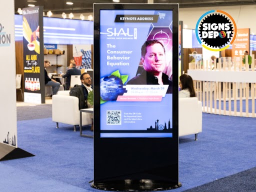
Digital signage isn’t just for airports. Use screens to display rotating info: meeting room schedules, weather updates, or even shoutouts to employees. Bonus: You can pivot faster than a TikTok trend—no need to reprint signs when the marketing team rebrands (again).
4. Local Flair, Global Appeal
A nod to your location adds charm without veering into cliché. A Toronto office might use maple leaf motifs in subtle corner designs. A Vancouver workspace could incorporate wave-like patterns or reclaimed barn wood from the Rockies. Keep it tasteful—think “inspired by,” not “tourist trap.”
Here are some best practices:
Consistency Is Key
All signs should feel like they’re from the same family. Pick a design theme (modern, rustic, industrial) and stick to it. Consistency in fonts, colors, and spacing builds a cohesive look that screams professionalism.
Sustainability Wins
Eco-friendly materials (recycled aluminum, bamboo) and energy-efficient LEDs aren’t just trendy—they’re a flex. Show clients and employees you care about the planet while keeping your office sharp.
Ask employees what works (and what drives them nuts). Maybe the accounting team needs bigger signs for the finance wing, or the font on the restroom placards is too small. Iterate until your signs are crowd-approved.
Whether you’re guiding guests to the boardroom or subtly reinforcing your brand’s cool factor, every sign should make a statement. Ditch the boring, embrace the intentional, and let your walls do the talking.
And hey, if you’re itching to transform your office into a signage masterpiece (without losing your mind), there’s a quirky crew up north who lives for this stuff. Signage Depot, the best sign company in Mississauga, is your go-to space for signs that work hard, look sharp, and maybe even crack a joke. Tell them we sent you.
Note: IndiBlogHub features both user-submitted and editorial content. We do not verify third-party contributions. Read our Disclaimer and Privacy Policyfor details.
Copyright © 2019-2025 IndiBlogHub.com. All rights reserved. Hosted on DigitalOcean for fast, reliable performance.


