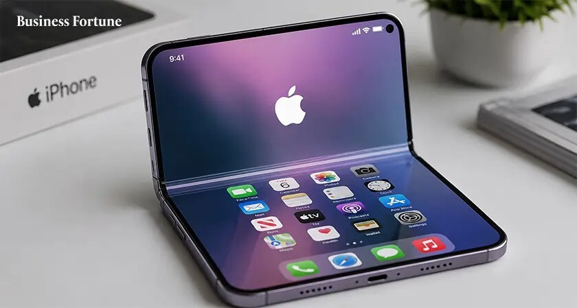
iPhone Lock Screen vs Glance: Clear Guide to First-Impression Design and Usability
-

- March 10th, 2026
- 546 views

FREE SEO Topical Map Generator: Find Your Next Content Ideas
The choice between iPhone Lock Screen vs Glance shapes the first impression users get when they pick up a device. This comparison explains what each presentation does, where it helps or hurts usability, and how to configure both for privacy, speed, and context-aware information.
- Lock Screen: full notifications, lock screen widgets, rich media controls, higher information density but more privacy exposure.
- Glance: simplified, transient view for quick status or glanceable widgets—less clutter, faster access, fewer interactions required.
- Use the provided FOCUS checklist to decide which suits a use case: Frequency, Options, Content, Urgency, Security.
Detected intent: Informational
iPhone Lock Screen vs Glance: What each one means
Definitions and core behaviors
The Lock Screen is the primary locked interface that appears when the device wakes: it shows notifications, time, lock screen widgets, and media controls while requiring authentication for deeper access. A Glance-style view refers to a minimal, transient screen that prioritizes one or two pieces of information (time, next calendar item, short widgets) and is designed for quick scanning rather than interaction.
When to expect each behavior
Lock screens are the default on smartphones and are optimized for notification management and quick actions. Glance views are useful for low-friction interactions: quick checks after a notification or to see a single metric without fully engaging the device. Many platform implementations (including configurable lock screens and contextual glance flows) let users choose how prominent each element should be.
Feature comparison: notifications, widgets, and privacy
Notifications and visibility
The Lock Screen exposes full notifications (unless restricted), allowing quick replies and expanded previews. In contrast, a Glance prioritizes brevity—short snippets, counts, or a single headline—reducing cognitive load and accidental data exposure.
Lock screen widgets and glance view differences
Lock screen widgets can surface actionable items (smart home controls, media, commute status) while glance views focus on glanceable widgets that present a single datapoint or quick-read text. Choosing between them depends on whether fast interaction or minimal distraction is the priority.
Privacy and security trade-offs
More information on the Lock Screen increases the risk of exposing private content. Glance views reduce that risk by design. For users with sensitive notifications, prefer glance-style summaries or configure notification previews to hide sensitive content.
Use the FOCUS checklist to decide
A practical named framework helps make consistent decisions. The FOCUS checklist evaluates first-impression design choices.
- Frequency — How often will the user check this information?
- Options — Are quick actions required, or is passive reading enough?
- Content — Is the content time-sensitive or private?
- Urgency — Does it require immediate response capability?
- Security — Will the content need protection behind authentication?
Apply FOCUS: choose Lock Screen when Frequency and Urgency are high and security can be managed; choose Glance when minimizing Options and protecting privacy are top priorities.
Real-world scenario
Consider a commuter who checks a phone on a train. The commuter needs next-transit time and a message preview. Using the FOCUS checklist: Frequency = high, Options = low (just view), Content = intermittent, Urgency = moderate, Security = low while in public. A glance-style widget showing next-transit time plus a collapsed message count meets the need better than a fully-expanded Lock Screen that displays message content and media playback controls.
Practical tips for configuration and design
- Set notification previews to 'When Unlocked' for sensitive apps to keep the Lock Screen less revealing in public.
- Prioritize one high-value widget per glance view—too many widgets defeat the purpose of quick scanning.
- Use actionable lock screen widgets only for tasks that truly benefit from immediate interaction (timers, home locks, media controls).
- Test the wake-to-glance speed on real devices; perceived responsiveness affects user preference more than feature count.
Common mistakes and trade-offs
Common mistakes
- Overloading the Lock Screen with widgets or notifications, causing information fatigue and accidental disclosure.
- Failing to tune glance information for the primary task—if it doesn’t answer a quick question in two seconds, it’s not a good glance.
- Assuming all users want the same default: some prefer rich lock screens, others value minimalism for privacy.
Trade-offs to consider
Choosing a dense Lock Screen maximizes interaction options but increases cognitive load and privacy risk. Choosing a minimal Glance reduces risk and speeds scanning but may require extra taps for tasks that need direct action. Balance depends on user context and how quickly authentication can be completed.
Implementation notes and standards
Designers and developers should consult platform guidelines for best practices when adjusting lock surfaces and glance interfaces. For example, platform Human Interface Guidelines explain how to present notifications, widgets, and privacy controls properly: Apple Human Interface Guidelines.
Core cluster questions
- How should lock screen widgets be prioritized for quick access?
- What privacy settings are recommended for lock screen notifications?
- When is a glance view preferable to a full lock screen?
- How does glance performance affect perceived usability?
- What are best practices for actionable items on the lock screen?
Secondary keywords
lock screen widgets glance view; lock screen notifications glance differences
FAQ
What is the difference between iPhone Lock Screen vs Glance?
The Lock Screen shows full notifications, widgets, and interaction options and is the primary locked interface. A Glance is a simplified, transient view designed for quick reading—typically showing less content, fewer actions, and better privacy by default.
How to make the Lock Screen less revealing in public?
Set notification previews to show only when unlocked, reduce the number of visible widgets, and disable sensitive app previews on the lock screen. Configure face or fingerprint unlock to minimize time exposed while unlocking.
Can glance views support actions like quick replies?
Glance views are usually read-only or provide a single, limited action. If quick replies are essential, the Lock Screen with controlled previews and authentication steps may be more appropriate.
Is a glance faster to access than the Lock Screen?
Yes—by design, a glance is optimized for speed and minimal interaction. However, the real-world difference depends on device wake speed and how the glance is implemented in the OS or app.
How to choose between glance and lock screen for an app's notifications?
Use the FOCUS checklist: if users need frequent, urgent interactions, prefer lock screen elements; if users mainly need quick awareness with limited interaction, prefer glance-style notifications and concise widgets.