What Makes a Great Law Firm Website? 7 Essentials That Build Trust and Drive Consultations
-

- April 22nd, 2026
- 3,724 views

FREE SEO Topical Map Generator: Find Your Next Content Ideas
When someone searches for a lawyer, they are rarely browsing casually. They may be dealing with a dispute, a notice, a family issue, a property matter, or a business problem that feels urgent and stressful. In that moment, a law firm’s website becomes much more than an online brochure. It becomes a first impression, a trust signal, and often the deciding factor in whether a potential client reaches out or keeps searching.
That is why a great law firm website is not only about elegant design. It is about helping people feel they are in the right place, that the firm understands their issue, and that taking the next step will be simple and safe.
Many legal websites fail at this quietly. They may look respectable on the surface, but still create hesitation. Some are too generic. Some bury key information. Some do not work well on mobile. Others do not clearly explain practice areas or make it difficult for visitors to contact the firm quickly.
A great law firm website does the opposite. It reduces uncertainty, builds confidence, and guides visitors toward consultation.
Here are seven essentials that make the difference.
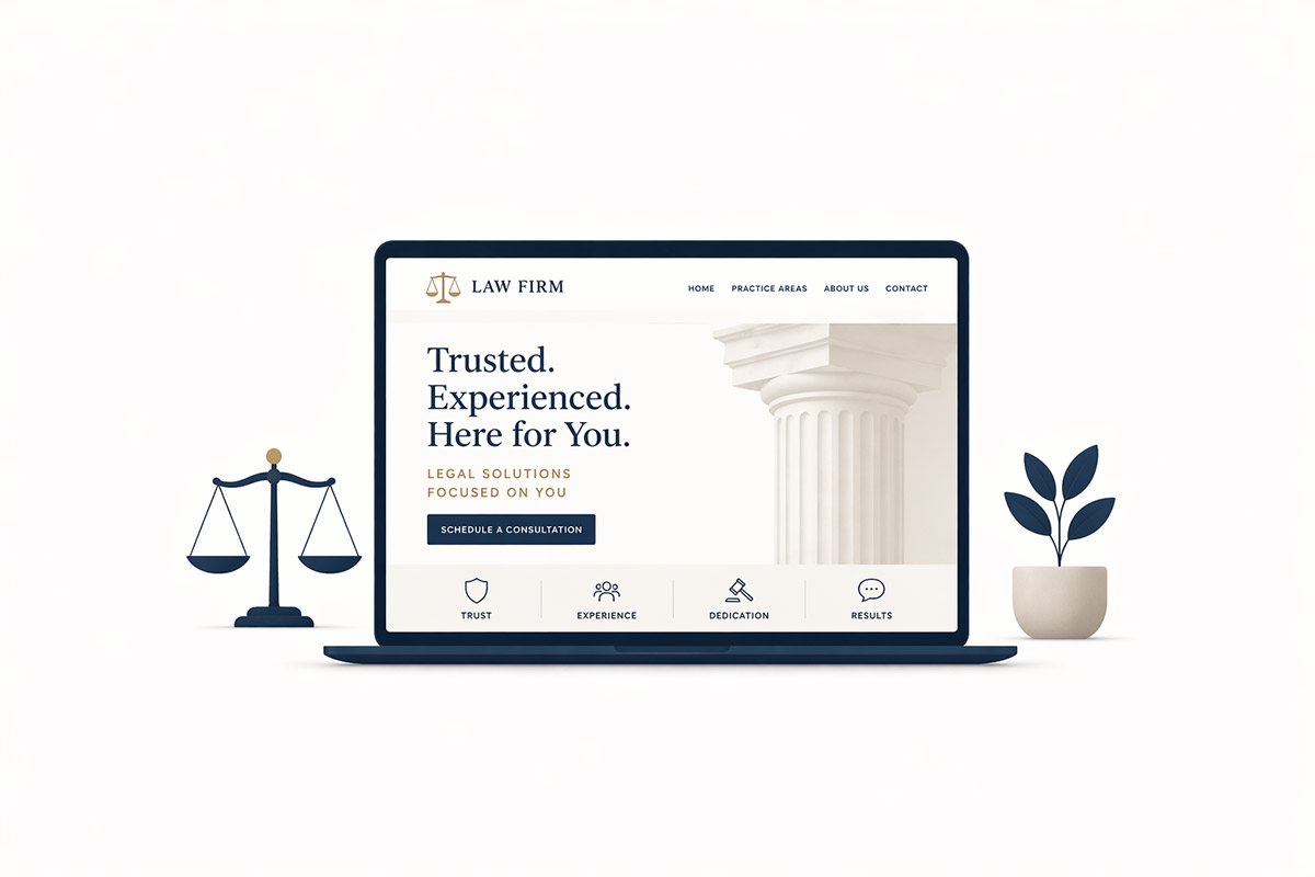
1. A professional design that immediately builds trust
Legal services are deeply trust-based. Before someone reads about your experience or fills out a contact form, they are already making judgments based on the look and feel of your website.
If the site feels outdated, cluttered, or inconsistent, visitors may subconsciously question the professionalism of the firm itself. On the other hand, a clean, modern, well-structured website signals credibility. It suggests that the firm is established, attentive, and serious about how it presents itself.
That does not mean a law firm website needs flashy effects or trendy design for the sake of it. In fact, the best legal websites usually feel calm, clear, and grounded. Typography should be easy to read. Colors should feel professional. Layouts should breathe. The design should reassure rather than overwhelm.
In legal services, design should support confidence, not compete for attention.
2. Clear practice area pages that match what clients are actually looking for
One of the biggest mistakes law firm websites make is grouping too many services into one broad page. A visitor lands on the site wanting help with divorce, property disputes, criminal defense, or business contracts, but instead finds a vague “Services” section with no real depth.
That weakens both trust and usability.
A stronger law firm website gives each key practice area room to stand on its own. This helps potential clients quickly confirm whether the firm handles their specific issue. It also makes the website easier to understand for search engines and more useful for people comparing options.
Dedicated practice area pages do not need to be excessively long, but they should be clear and purposeful. They should explain what the firm helps with, the kind of matters it handles, and how a visitor can move forward. This creates confidence because the website feels more specific, not generic.
3. A mobile experience that works effortlessly
Many legal searches happen on phones, often in urgent moments. Someone looking for a criminal lawyer, family lawyer, property lawyer, or legal consultant may not be sitting at a desk with time to explore a complex website. They may be searching while commuting, during a stressful conversation, or after receiving bad news.
That means the mobile experience is not secondary. It is central.
A great law firm website should feel easy to use on a phone from the very first screen. Text should be readable. Buttons should be easy to tap. Menus should be simple. Important information such as phone number, office location, and consultation options should be immediately accessible.
If a visitor has to pinch, zoom, scroll awkwardly, or hunt for contact details, the site is creating friction at exactly the wrong time. In legal services, small usability issues can cost real enquiries.
4. Trust signals that make people feel safer contacting you
A law firm website should answer a silent question every visitor is asking: “Can I trust these people with my matter?”
That question is not answered by saying “We are the best.” It is answered through proof and reassurance.
Strong trust signals may include attorney or advocate profiles, years of experience, jurisdictions served, client reviews, recognitions, credentials, bar affiliations where relevant, or even a simple explanation of how the consultation process works. The point is not to overload the site with claims. The point is to reduce uncertainty.
Even small details can help. Professional team photos, a clearly written About page, secure browsing, and a thoughtful FAQ section all contribute to the sense that the firm is credible and approachable.
Trust is built in layers. The more those layers are present, the easier it becomes for a visitor to take the next step.
5. Fast loading and technically sound performance
A law firm website does not need to be built like a tech startup product, but it does need to work smoothly.
If pages load slowly, key sections jump around, or forms behave unpredictably, the visitor experience suffers. People dealing with legal stress already have enough uncertainty. A sluggish or unstable website adds one more reason to leave.
Performance also affects how polished the firm feels. A fast site feels cared for. A slow site feels neglected.
This is especially important because many law firm websites rely on several trust-building elements at once: photos, service pages, reviews, location information, contact forms, and blog content. Without good structure and optimization, these can easily make the site heavier than it needs to be.
A great legal website balances presentation with performance. It feels refined, but still quick.
6. Strong calls to action that reduce hesitation
Potential clients should never have to guess what to do next.
A common weakness on law firm websites is that the path to contact is vague. The site may list a phone number somewhere in the header and include a generic contact form at the bottom, but it does little to guide the visitor toward action.
A stronger website uses clear, reassuring calls to action throughout. That may be “Request a Consultation,” “Call Now,” “Speak With Our Team,” or “Discuss Your Matter.” The wording can vary, but the goal stays the same: make the next step obvious and comfortable.
The contact process should also feel low-friction. Forms should not be unnecessarily long. Phone links should work on mobile. Office location or service area details should be easy to find. If the firm uses WhatsApp or another preferred channel, that can be integrated thoughtfully too.
When a visitor is already anxious, clarity matters more than cleverness.
7. Content that helps before it tries to sell
A great law firm website does not only talk about the firm. It also helps the visitor think more clearly.
That might mean having concise answers to common doubts, explaining what happens during an initial consultation, outlining broad next steps, or publishing useful content around recurring legal questions. This kind of content does not replace legal advice, but it can make the site feel more humane, informed, and client-focused.
It also supports the larger role a law firm website should play: guiding someone from uncertainty to action.
When a website gives people clarity, it feels more trustworthy. It shows that the firm understands not only the law, but also the emotional state of the person searching for help.
This is one reason thoughtful law firm website design matters so much. The best legal websites are not just beautiful pages. They are structured to answer questions, build trust, and make consultations easier to begin.
Final thoughts
A great law firm website is not defined by style alone. It succeeds because it understands how legal clients think.
They want reassurance. They want clarity. They want to know whether the firm handles their matter, whether it feels credible, and whether making contact will be simple and safe.
When a website combines professional design, strong practice area structure, mobile usability, trust signals, performance, clear calls to action, and helpful content, it does far more than “look good.” It starts working as a real business asset.
And for law firms, that often means the difference between a website that merely exists and one that consistently drives meaningful consultations.
Learn more about our services here: https://www.raycreations.net/law-firm-website-design/