Practical Paint Color Selector Guide for Room Color Scheme Planning
-

- March 25th, 2026
- 187 views


FREE SEO Topical Map Generator: Find Your Next Content Ideas
Using a paint color selector in room planning
A paint color selector is a tool or method used to pick wall colors and coordinate a room color scheme. When selecting paint, a systematic approach reduces mistakes and ensures the final palette supports light, scale, and furnishings. This guide explains how to use a paint color selector, offers a named framework, a testing checklist, practical tips, and a short real-world example.
- Use the PAINT framework (Proportion, Accent, Undertone, Natural light, Texture).
- Test 2–3 large samples under different light throughout the day.
- Balance scale and contrast: lighter walls enlarge, darker walls add depth.
- Avoid common mistakes: ignoring undertones, small chip testing, and mismatched finishes.
How a paint color selector works
Most paint color selectors combine visual tools (swatches, digital simulators) with a selection process: define room goals, evaluate light, sample paints, and finalize finishes. Digital color pickers help narrow options quickly, but physical samples and observation are essential because color appearance changes with angle, light source, and surrounding materials.
PAINT framework: a practical selection checklist
Use the PAINT framework as a repeatable checklist when planning any room color scheme.
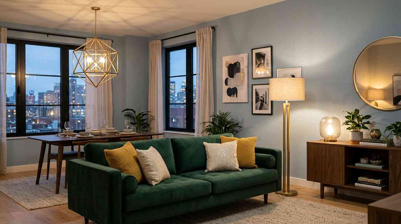
- Proportion — Determine how much of the room each color will cover (walls, trim, accent wall). A common split is 60% main color, 30% secondary, 10% accent.
- Accent — Choose one accent color to highlight architectural elements or focal furniture.
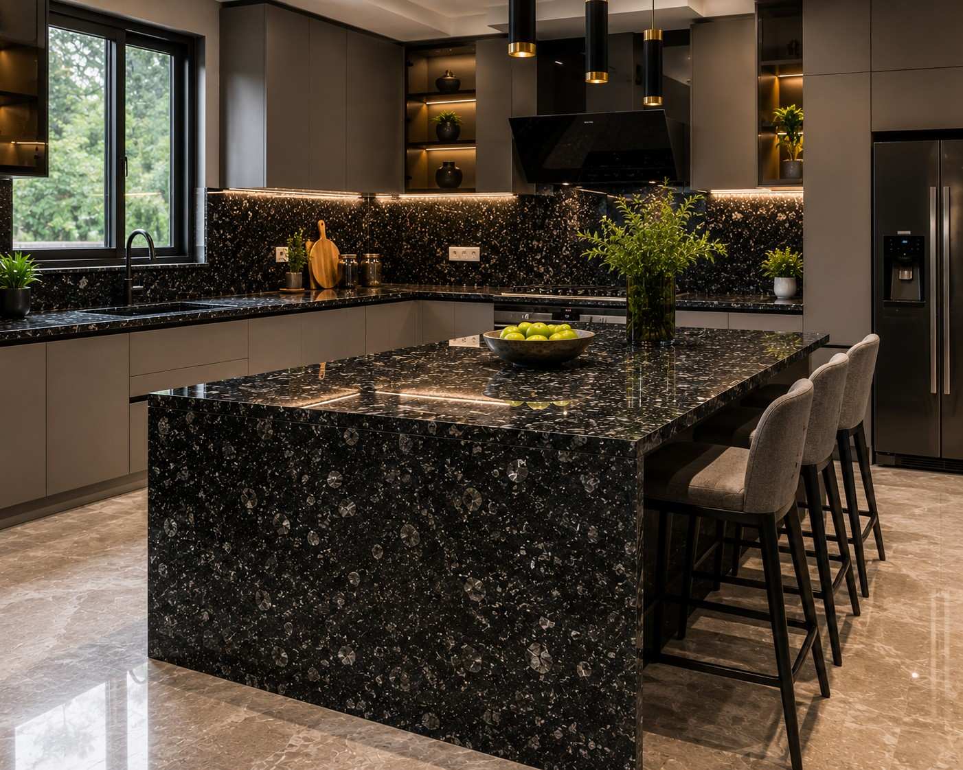
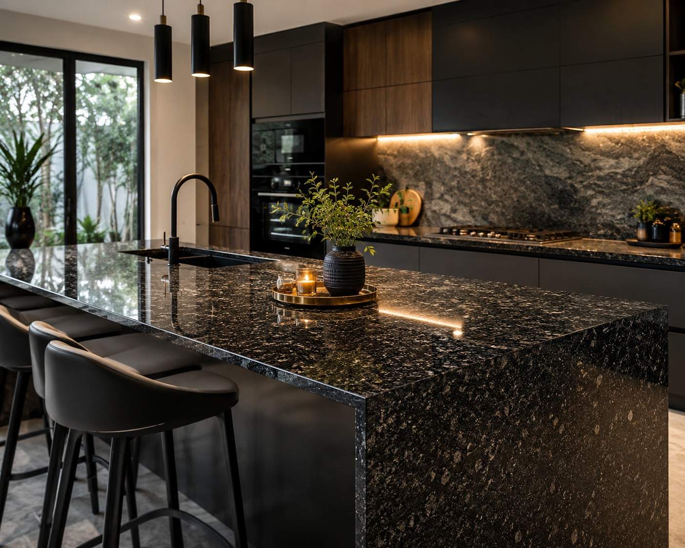
- Undertone — Identify the undertone (warm, cool, neutral) of existing materials like flooring and countertops and match paint undertones accordingly.
- Natural light — Observe the room at morning, midday, and evening; north- and south-facing rooms shift differently with daylight.
- Texture — Consider sheen and surface texture; matte versus satin will change perceived depth and color saturation.
Step-by-step: How to use a paint color selector
- Define the room goal: desired mood, function, and whether the space should feel larger or cozier.
- Collect 5–8 candidate colors using a color selector tool or swatch deck; include varied lightness and undertones.
- Cut sample-sized cards or buy sample pots and apply large patches (2' x 2' minimum) on different walls.
- Observe samples at multiple times and with different light sources (daylight, lamp light). Note shifts in undertone and contrast with furnishings.
- Narrow to 2–3 colors, then pick sheens for walls, trim, and ceilings. Confirm final selections on full-sized test patches before buying full paint quantities.
Practical tips for reliable color decisions
- Use full-size patches rather than small chips; color reads differently at scale.
- Record the paint brand and color code of each test patch to avoid confusion.
- Photograph samples at the same time each day to compare changes objectively.
- Consider the finish: eggshell hides wall texture better than semi-gloss, which reflects more light and intensifies color.
Common mistakes and trade-offs when planning color schemes
Common mistakes often come from skipping testing or overlooking lighting. Key trade-offs include:
- Natural light vs. color saturation: bright sun can wash out saturated hues, while low light deepens them.
- Neutral flexibility vs. personality: neutral walls allow furniture to stand out but may feel bland without accents.
- Sheen vs. imperfection visibility: higher sheen shows flaws but cleans easier; matte conceals but is harder to spot-clean.
Avoid matching paint purely by name; compare undertones with existing materials. Overly relying on digital previews without physical testing leads to surprises.
Tools, standards, and a single authoritative reference
Digital color selectors, paint manufacturer apps, and physical fan decks are complementary. For technical color matching and understanding color difference, refer to color measurement standards from the International Commission on Illumination: CIE. Using a spectrophotometer or professional matching service is appropriate when exact matching to materials or historic colors is required.
Short example scenario
A 12x14 bedroom with oak floors and south-facing windows: goal is calming, slightly warm atmosphere. Using the PAINT checklist, three candidates were selected—a pale warm gray, a muted sage, and a soft warm beige. Large sample patches showed the sage read green under midday sun, while the warm gray harmonized with flooring and retained warmth under evening lamps. Final decision: warm gray walls, sage as a bedding/accent color, and crisp white trim in satin for clean contrast.
Practical testing checklist
- Apply at least 2' x 2' sample patches on each wall type.
- Observe at morning, midday, and evening lighting.
- Compare samples next to main furniture and flooring.
- Confirm sheen choices and buy a small backup quart for touch-ups.
FAQ: Which paint color selector options work best?
Digital selectors are fast for narrowing choices and previewing palettes, but the best approach pairs digital tools with physical swatches and large test patches for final decisions.
FAQ: How to choose paint colors for a room when lighting is poor?
In low-light rooms, select lighter tones with warm undertones to add perceived brightness. Matte or eggshell finishes reduce glare and help color appear even.
FAQ: Can a paint color selector guarantee exact color matching?
Exact matching requires instrument-based color measurement and professional mixing. Visual matching via selectors and chips can achieve close results but testing is necessary before full application.
FAQ: What is the best way to test samples before committing to a color?
Apply large samples (2' x 2' or larger), observe them under all light conditions, view next to furniture and flooring, and record brand and code. Test sheen separately when possible.
FAQ: How to use a paint color selector to plan a cohesive scheme for an entire home?
Start with a base neutral across connected spaces, then choose a small palette of coordinating accents for individual rooms. Use the PAINT framework to keep undertones and proportions consistent for smooth transitions between rooms.