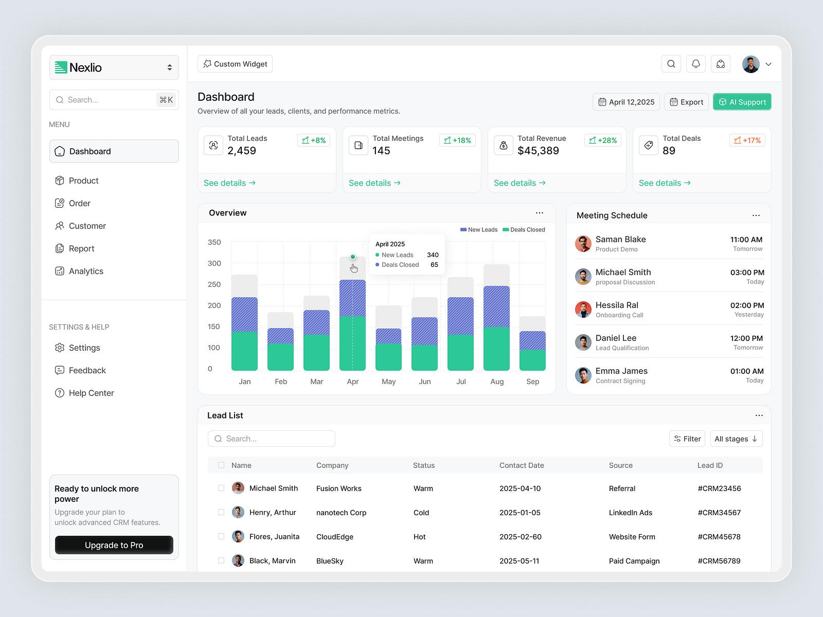
Why Your Salesforce UX Is Failing (And How to Fix It)
👉 Best IPTV Services 2026 – 10,000+ Channels, 4K Quality – Start Free Trial Now
Salesforce promises efficiency, automation, and scalability—but if your users are frustrated, slow, or avoiding the platform altogether, the problem isn’t Salesforce. It’s the user experience you’ve designed around it.
A poor Salesforce UX (User Experience) isn’t just inconvenient—it’s costly. It leads to low adoption, inconsistent data, longer sales cycles, and user fatigue. So if your Salesforce implementation is underperforming, it’s time to look deeper at the UX decisions behind it.
1. Too Many Fields, Tabs, and Clicks
The Symptom:
Users feel overwhelmed when opening a record. Dozens of fields, unrelated tabs, and a maze of buttons cause frustration.
Why It Happens:
Out of the box, Salesforce comes packed with features. But most orgs never tailor it down to what each user actually needs.
The Fix:
- Simplify page layouts by role and record type.
- Use Dynamic Forms to show only relevant fields when certain criteria are met.
- Group data using accordion sections or collapsible panels.
Pro Tip: Interview end-users. Ask them what they actually use. Most of the clutter is legacy baggage.
2. Disconnected Workflows Across Apps
The Symptom:
Users must hop between multiple objects, apps, or even browsers to complete one task—killing momentum.
Why It Happens:
Process builders and integrations were added reactively. No one mapped out the actual end-to-end user journey.
The Fix:
- Map workflows from the user’s point of view, not just the system’s.
- Use Flow Builder to create guided, multi-step experiences within a single screen.
- Leverage App Pages in Lightning to bring relevant records and actions into one place.
Pro Tip: Use Salesforce’s “Path” component for guided selling or case resolution steps—it improves clarity and consistency.
3. Inconsistent Interfaces Across Teams
The Symptom:
Each department’s Salesforce instance feels different, with distinct layouts, terminology, colors, and component behaviors.
Why It Happens:
Without a UX governance model, admins and developers build inconsistently based on siloed needs.
The Fix:
- Develop a Salesforce Design System or style guide for internal use.
- Standardize component use across departments.
- Use Lightning Design System (SLDS) to ensure visual consistency.
Pro Tip: Invest in Design Tokens and reusable components when building custom LWC (Lightning Web Components).
4. Mobile Experience is Frustrating
The Symptom:
Users avoid the Salesforce mobile app—or complain it’s slow, hard to use, or not tailored to their tasks.
Why It Happens:
Desktop workflows were cloned into mobile without considering mobile-specific behavior or screen limitations.
The Fix:
- Design mobile-first page layouts for field reps and on-the-go users.
- Use Quick Actions, not full page forms.
- Consider Mobile Cards to surface only high-value content.
Pro Tip: Use Salesforce’s Mobile Publisher to build a branded, streamlined app that’s faster and task-focused.
5. Slow Load Times and Laggy Interfaces
The Symptom:
Pages take forever to load. Users complain about slow responsiveness, particularly when working with large records or dashboards.
Why It Happens:
Overloaded components, unoptimized queries, and excessive automation slow things down.
The Fix:
- Review and optimize SOQL queries and reduce data-heavy components.
- Audit automation (Flows, Triggers) to eliminate unnecessary steps.
- Paginate dashboards and reports to load faster.
Pro Tip: Use Salesforce Optimizer and Lightning Usage App to identify what’s slowing down your org.
6. Lack of Personalization
The Symptom:
Salespeople, service reps, and marketers all see the same layouts, even though their daily needs differ drastically.
Why It Happens:
The org was built generically—everyone gets the same experience.
The Fix:
- Create Role-Based Apps with custom navigation bars and components.
- Use Record Types, Page Layouts, and Profiles to tailor what users see.
- Implement Home Pages with relevant dashboards, tasks, and insights per role.
Pro Tip: Consider Einstein Recommendations and AI-powered insights for proactive UX enhancements.
7. No Onboarding or In-App Guidance
The Symptom:
New users get lost. Adoption is low. You spend too much time training instead of enabling.
Why It Happens:
Users are thrown into Salesforce with no orientation. No onboarding journeys or contextual help is available.
The Fix:
- Use tools like In-App Guidance and myTrailhead to create onboarding paths.
- Offer tooltips, pop-ups, and walkthroughs for complex screens.
- Create a training sandbox where users can experiment risk-free.
Pro Tip: Make feedback loops part of the design. Ask users what they find confusing—and improve from there.
8. Missing Metrics on UX Effectiveness
The Symptom:
You’re not sure what’s working, what isn’t, or where users drop off.
Why It Happens:
UX is rarely treated as a measurable performance area within Salesforce.
The Fix:
- Track user behavior with Event Monitoring or third-party tools like Pendo or WalkMe.
- Use custom report types to measure click-throughs, time-in-field, or skipped steps.
- Include UX goals in adoption KPIs and quarterly reviews.
Pro Tip: Use surveys and feedback prompts at the end of tasks to gather qualitative insights.
Don’t Let UX Undermine ROI
If Salesforce feels painful to your team, it’s not just annoying—it’s expensive. Productivity drops, morale suffers, and your investment underperforms. But every issue above can be resolved—not with more licenses or features—but with smarter UX design.
Salesforce gives you the flexibility to customize everything—from layouts and automations to guidance and themes. The real question is: Are you designing your system around your users, or expecting them to adapt to the system?
Our team specializes in Salesforce Consultation and UX redesign—turning clunky Salesforce experiences into intuitive, high-performing systems. Whether you need better adoption, smoother workflows, or a mobile experience your reps actually love—we’re here to help.


