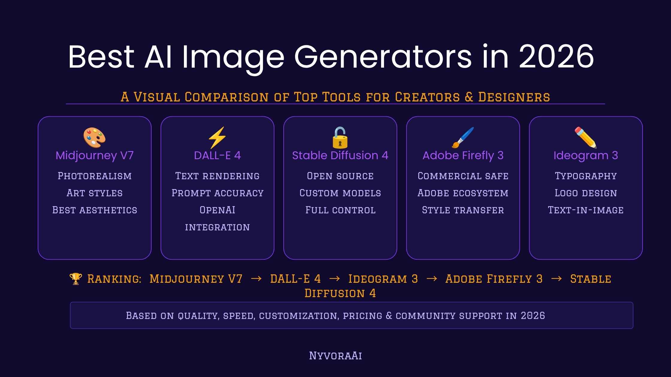
Midjourney vs DALL-E Image Quality: Practical Comparison, Checklist, and Trade-offs
-

- March 25th, 2026
- 187 views

FREE SEO Topical Map Generator: Find Your Next Content Ideas
Compare output consistently when assessing Midjourney vs DALL-E image quality: focus on resolution, artifact levels, compositional accuracy, and how models render fine details such as faces, text, and complex textures.
- Midjourney often emphasizes stylized detail and texture; DALL·E tends toward cleaner, sometimes more literal compositions.
- Key quality factors: model architecture, training data, decoding strategy, and upscaling/post-processing.
- Use the CRAFT checklist to evaluate images and reduce common mistakes like broken text and jagged edges.
Midjourney vs DALL-E image quality
Image-quality comparisons between these two models should target measurable attributes: sharpness, noise, artifact frequency, color fidelity, compositional correctness, and how reliably each model follows a prompt. When judging Midjourney vs DALL-E image quality, use controlled prompts and the same output size to compare differences objectively.
How the models differ technically and what that means for image quality
Differences in visual outcomes come from several sources: learning objectives in training, dataset variety, diffusion parameters, aesthetic tuning, and the default sampling pipeline. Midjourney is tuned for aesthetic richness and often produces dramatic textures and lighting. DALL·E (and similar OpenAI image models) typically aims for balanced, literal renderings with fewer decorative artifacts. These characteristics affect render quality DALL·E produces versus Midjourney’s style-driven output.
For a direct reference on how model behavior and generation controls affect images, consult official model guides for best practices: OpenAI image generation docs.
CRAFT quality checklist (named framework)
Use the CRAFT checklist to evaluate AI-generated images quickly and consistently.
- Composition — Are subjects placed correctly? Does perspective look natural?
- Resolution & Detail — Are edges crisp? Is microtexture preserved at the target size?
- Artifacts — Any noise, banding, or unnatural blending around edges or in shadows?
- Fidelity to prompt — Does the image match specified content, style, and textual elements?
- Tone & Color — Are colors plausible and does dynamic range suit the scene?
Using the checklist: quick method
- Score each category 1–5, then prioritize improvements on the lowest scores.
- When testing multiple models, keep seed, aspect ratio, and prompt constants for fair comparison.
Practical example scenario
Scenario: Create a product hero image for a leather journal with embossed text and shallow depth of field. Using the CRAFT checklist: composition should center the journal on a wooden table; resolution must preserve embossed detail; artifacts must be absent around the embossing; fidelity requires legible embossed text; tone needs warm, natural lighting.
Testing both models with the same prompt and camera settings reveals trade-offs: Midjourney may add stylized grain and richer shadows that highlight texture but can deform small text; DALL·E may render the embossing more cleanly but with flatter contrast. Choose the output that aligns with the final use—marketing hero vs. close-up detail shot—and plan post-processing accordingly.
Practical tips to improve final output
- Standardize the prompt: fix camera angle, lighting, aspect ratio, and the exact wording for text or logos to reduce variation.
- Generate multiple seeds and select the best candidate before upscaling—artifact frequency varies between runs.
- Use targeted upscalers and edge-preserving denoisers for detail-heavy subjects; compare results against originals to catch new artifacts.
- When text must be precise, composite a vector/text layer into the image instead of relying on model-rendered typography.
- Document settings (sampling steps, CFG scale, model version) to reproduce preferred outputs reliably.
Trade-offs and common mistakes
Trade-offs:
- Stylization vs. literal accuracy: More stylized outputs usually increase perceived texture but can reduce exactness of shapes and text.
- Sharpness vs. artifacts: Aggressive sharpening or upscaling can introduce ringing and haloing—balance is necessary.
- Speed vs. fidelity: Faster sampling or lower-resolution previews cut generation time but hide subtle defects that appear on final renders.
Common mistakes
- Comparing different output sizes or aspect ratios—always match dimensions for fair assessment.
- Relying on a single seed—one result is not representative of a model’s behavior.
- Expecting perfect text rendering—most generators struggle with complex or small typography; compositing is often required.
Evaluating results: objective checks and metrics
Combine visual inspection with simple metrics where appropriate: pixel-level PSNR or SSIM against a reference (if one exists), perceptual distance (LPIPS), and human A/B testing for subjective preferences. For production work, create acceptance criteria: maximum allowed artifact rate, minimum readable text size, and acceptable color delta.
FAQ
Midjourney vs DALL-E image quality: which is better for photorealism?
Neither model is universally better; photorealism depends on prompt design, target subject, and post-processing. DALL·E variants often produce cleaner, more literal images, while Midjourney tends to emphasize stylistic richness. Use controlled A/B tests with the CRAFT checklist to decide for a specific use case.
How can image upscaling artifacts be minimized?
Use modern upscalers that preserve edges, apply mild denoising before upscaling, and avoid excessive sharpening. Compare different upscalers and inspect at 100% to catch haloing or texture smearing.
What prompt strategies improve rendering of fine details and text?
Include explicit camera and lens parameters, request "high-detail" or "macro" for close-ups, and avoid instructing the model to draw specific fonts. For critical text, render a placeholder and composite the actual text using a design tool.
How to compare models in an AI image generator comparison test?
Keep inputs constant (seed, aspect ratio, prompt), generate multiple outputs per model, use the CRAFT checklist, and include blind human reviewers when possible to measure subjective preferences.
What are typical signs of overfitting or dataset bias in generated images?
Repeated artifacts, stereotyped backgrounds, or consistent misrendering of rare items suggest dataset bias or aesthetic overfitting. Address these by varying prompts, increasing diversity in training data (for custom models), or choosing a model whose training domain better matches the target content.