Printed Perfume Boxes That Reflect Professional Fragrance Branding
-

- May 07th, 2026
- 3,692 views

FREE SEO Topical Map Generator: Find Your Next Content Ideas
Fragrance is one of the few product categories where the packaging has to carry the entire brand conversation before the product itself gets a chance to speak. You can't sample a scent through a shelf display. You can't communicate top notes through a product listing image. What you can do what the packaging has to do is create enough visual and tactile credibility that a consumer reaches for it, picks it up, and stays engaged long enough for the actual product to become relevant.
That's a heavy lift. And it's one that printed perfume boxes either accomplish or fail at, usually within the first two or three seconds of shelf exposure.
Why Print Quality Is a Brand Equity Issue, Not Just a Production Variable
I've reviewed a lot of fragrance packaging programs over the years, and the gap between brands that understand print as a strategic asset and those that treat it as a commodity spec is significant and visible. Literally visible, on the shelf.
Print quality in the fragrance category isn't just about color accuracy, though that matters enormously. It's about how the printed surface interacts with the finishing layers applied over it, how consistent the output is across a full production run, and whether the printed design holds its integrity at the small detail scale fine typographic elements, hairline rules, gradient transitions that luxury fragrance packaging demands.
Printed perfume boxes produced through offset lithography on well-calibrated equipment, with proper ink density management and tight registration control, look categorically different from cartons run through a process where these variables aren't actively managed. The difference isn't always obvious in isolation. Put the two side by side in a retail environment and it becomes unmistakable.
The Substrate Decision Comes Before the Print Decision
One mistake that comes up consistently and it's one that delays timelines and increases costs significantly when it happens is brands finalizing their print design before locking the substrate. The board weight, coating type, and surface texture all affect how ink behaves and how finishing treatments adhere. Designing for a 400gsm folding carton with a soft-touch laminate and then switching to an uncoated board mid-development isn't a simple adjustment. It can require substantial redesign of color values and finishing specifications.
The substrate also determines which print processes are viable. Certain inline coating applications require specific board surface treatments. Foil stamping adhesion varies significantly depending on whether the base material is cast-coated, machine-finished, or laminated. These are decisions that need to be made upstream, not retrofitted around a design that was developed without them in mind.
IBEX Packaging works with brands at the substrate selection stage rather than waiting until a design is finalized which is the approach that actually produces coherent results. When the print strategy and material decisions are developed together, the finished package reflects that integration.
Finishing Treatments and the Print Foundation They Require
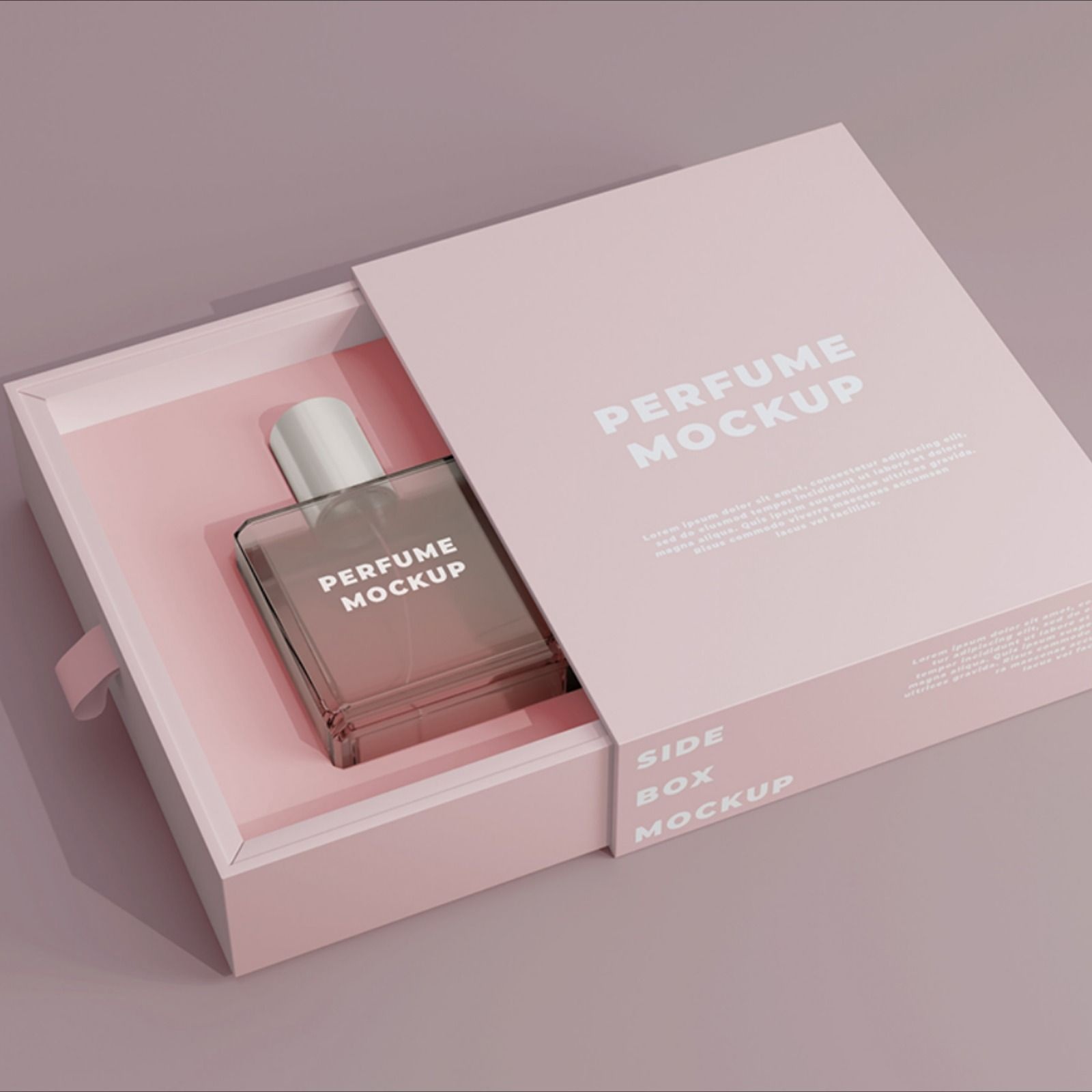
Spot UV varnish, soft-touch lamination, hot foil stamping, embossing these finishing techniques are what give printed perfume boxes their premium character in the luxury fragrance space. But they're not independent of the print layer beneath them. They amplify what's there, which means a weak print foundation produces a weak finished result regardless of how many treatments are applied on top.
Spot UV works through contrast. The technique creates a visual tension between coated and uncoated surface areas gloss against matte, light-catching against light-absorbing. For that contrast to read properly, the base print needs to be consistent in color density and surface finish. Inconsistency in the print layer creates visual noise that the spot UV makes more obvious, not less.
Hot foil stamping on a printed carton requires that the ink coverage in the stamping zone be appropriate for the foil adhesion temperature and pressure being used. Over-inked areas can cause foil lifting. Under-inked areas can affect the sharpness of the stamped impression. These are technical realities that an experienced print and packaging supplier anticipates and manages not surprises that show up on a finished production run.
My honest opinion: brands that skip prototype and press approval stages to accelerate timelines are taking a risk that's rarely worth it. A run of printed perfume boxes with inconsistent foil registration or color drift across the production batch creates problems that are expensive to remediate and damaging to retailer relationships if the product has already been placed.
Color Management Across Channels
Here's something that doesn't come up often enough in packaging briefs: the color your design looks on screen, the color it looks on a printed proof, and the color it looks on a finished production carton with lamination and varnish applied are three different things. Managing those transitions requires deliberate color profiling at each stage, and it requires a supplier who is set up to do that work systematically.
Fragrance brands with strong visual identities specific Pantone references, proprietary color standards need suppliers who can hold those standards under real production conditions. IBEX Packaging maintains calibrated color management protocols across their press lines specifically because fragrance and cosmetic clients can't afford color variance in a category where brand recognition is so heavily tied to specific visual signatures.
A Structural Note That Often Gets Overlooked
The print design on a carton has to account for the structural fold lines, bleed zones, and panel adjacencies that define the three-dimensional form. Designs that look cohesive in a flat dieline layout sometimes create awkward visual breaks at fold edges or panel transitions when the carton is actually erected. Reviewing designs in a physically constructed mock-up not just a digital 3D render catches these issues before they become production problems.
Final Words
Printed perfume boxes are where a fragrance brand's visual identity becomes physical reality. The print process, substrate, finishing specification, and color management approach all contribute to whether that reality matches the brand's intentions. Work with suppliers like IBEX Packaging who treat print as a technical discipline, not a production commodity because in the fragrance category, what's on the outside of the box determines whether anyone ever gets to experience what's inside it.
For more information: https://ibexpackaging.com/perfume-boxes/