The Impact of Mobile-Friendliness on Your Website Health
-

- August 23rd, 2025
- 376 views

FREE SEO Topical Map Generator: Find Your Next Content Ideas
In today's digital world, where mobile devices have become an essential part of our daily lives, having a mobile-friendly website is no longer a luxury but a necessity. More than half of global web traffic now comes from mobile devices, and this shift in user behavior has prompted search engines like Google to prioritize mobile-first indexing. As a result, mobile-friendliness has a direct impact on your website's health and overall performance. Let’s explore how mobile-friendliness affects your website’s health, why it’s essential, and how you can ensure your site remains optimized for mobile users with the help of tools.
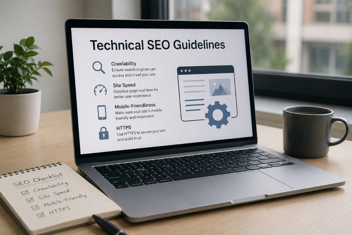
Why Mobile-Friendliness Matters
1. Improved User Experience
A mobile-friendly website ensures that users can easily navigate your site, regardless of the device they are using. If your site is hard to navigate on smartphones or tablets, users are likely to bounce away quickly, resulting in a poor user experience (UX). A good UX is crucial for keeping visitors engaged, leading to higher engagement rates, longer sessions, and ultimately more conversions.
Mobile-friendly websites adjust their design, content, and layout based on the screen size of the device. For example, images may be resized, buttons may be repositioned, and text may adjust to remain legible. When users have a smooth and pleasant browsing experience on mobile, they are more likely to stay longer, browse more pages, and complete desired actions, such as making a purchase or filling out a contact form.
2. Enhanced SEO Ranking
Google has made it clear that mobile-friendliness is a key factor in determining search engine rankings. Since the majority of users now access websites via mobile devices, Google and other search engines prioritize mobile-friendly websites in their rankings. A website that is not optimized for mobile may not only lead to a poor user experience but also hurt your search engine visibility.
In fact, Google uses mobile-first indexing, meaning it predominantly uses the mobile version of your website’s content for indexing and ranking. This means that if your site is not mobile-friendly, your SEO efforts could go to waste, leading to lower organic search rankings and reduced traffic.
3. Faster Loading Times
Website load speed is another crucial aspect of both user experience and SEO. Mobile users expect websites to load quickly. If your website takes too long to load on mobile devices, users may abandon your site before it even fully loads. Slow-loading websites are a significant contributor to high bounce rates and poor conversion rates.
Ensuring your site is mobile-friendly can significantly improve its loading speed on mobile devices. Techniques like image compression, optimized code, and responsive design can help reduce load times and deliver a better experience to mobile users.
4. Higher Conversion Rates
Mobile-friendly websites not only attract more visitors but also increase the likelihood of conversions. Whether it's signing up for a newsletter, making a purchase, or filling out a contact form, mobile-optimized websites ensure that users can easily complete these actions without facing obstacles. A frustrating, difficult-to-navigate mobile experience can lead to cart abandonment or missed opportunities.
For instance, responsive design ensures that buttons are large enough to be tapped easily, forms are optimized for mobile input, and pop-ups don’t obstruct the user’s view. These small but significant improvements make it easier for users to convert, resulting in higher conversion rates.
5. Increased Mobile Traffic
With mobile traffic continuing to grow year by year, it's essential that your website can handle the influx of mobile visitors. Mobile-friendly websites are better equipped to handle the increasing number of mobile users, allowing you to tap into this vast audience. Failing to optimize your site for mobile devices means missing out on potential customers and traffic from a significant portion of the internet population.
Additionally, Google’s Mobile-First Indexing means that the mobile version of your website is the one that gets crawled and indexed. If your mobile site is not optimized, search engines may not properly crawl or index your content, which could hurt your site’s performance.
How to Ensure Your Website is Mobile-Friendly
To ensure your website is mobile-friendly, there are several steps you can take, such as:
1. Responsive Design
Responsive web design automatically adjusts your website’s layout and content based on the user’s screen size. This ensures that your website looks good and works well on all devices, from smartphones to desktops. Implementing responsive design is one of the best ways to make your website mobile-friendly.
2. Optimize for Touch
Mobile users interact with websites via touch, so it’s important to ensure your website elements are optimized for touch interaction. Buttons should be large enough to tap easily, and menus should be easy to navigate without requiring precise clicks.
3. Reduce Page Load Times
Slow loading times can hurt both your mobile user experience and your search rankings. To improve mobile loading times, optimize images, reduce heavy scripts, and use browser caching to store data for faster loading.
4. Test Your Website Regularly
Regularly testing your website’s mobile performance is essential to maintaining its mobile-friendliness. This can be done through online tools that help identify issues with mobile optimization. For example, UpKepr Website Health Checker can run comprehensive tests on your website, identifying potential mobile usability issues and providing actionable insights to improve performance.
UpKepr Website Health Checker for Mobile Optimization
UpKepr Website Health Checker is a powerful tool that allows you to monitor and assess the health of your website, ensuring it’s optimized for all devices, including mobile. By running regular health checks, you can identify mobile-specific issues, such as slow loading times, broken links, or poor mobile navigation. With UpKepr tool, you can:
- Analyze Mobile Usability: Identify if your website’s layout or design is affecting user experience on mobile devices.
- Check for Speed Issues: Test the mobile version of your site for load speed and see where improvements are needed.
- Spot SEO Problems: UpKepr can detect mobile-specific SEO issues that could affect your rankings in search engines.
With the data provided by UpKepr, you can make the necessary adjustments to your website to improve its mobile-friendliness, enhance user experience, and boost SEO rankings.
Conclusion
Mobile-friendliness plays a significant role in the overall health of your website. It impacts everything from user experience and SEO ranking to conversion rates and mobile traffic. By ensuring your website is optimized for mobile users, you can create a seamless, user-friendly experience that keeps visitors engaged and boosts your site’s performance.
Regularly monitoring your website’s health and mobile optimization is crucial to maintaining its success. Tools like UpKepr Website Health Checker can help you identify areas that need improvement, allowing you to ensure your website remains mobile-friendly and competitive in today’s mobile-first world. Make mobile optimization a priority, and your website will thrive in a mobile-driven digital landscape.


