How to Use a Yellow and Bronze Palette: Timeless Warmth for Home and Brand
-

- March 02nd, 2026
- 358 views

Get a free topical map and start building content authority today.
Using a yellow and bronze palette brings warm metallic richness to interiors, product design, and branding. The yellow and bronze palette mixes sunny hues with muted metallics to create spaces and visuals that feel both modern and timeless — suitable for living rooms, hospitality, packaging, and digital interfaces.
Detected intent: Informational
This guide explains what a yellow and bronze palette is, how to choose tones and finishes, a named BRONZE framework for selecting combinations, one short real-world example, 4 practical tips, and common mistakes to avoid.
Why choose a yellow and bronze palette
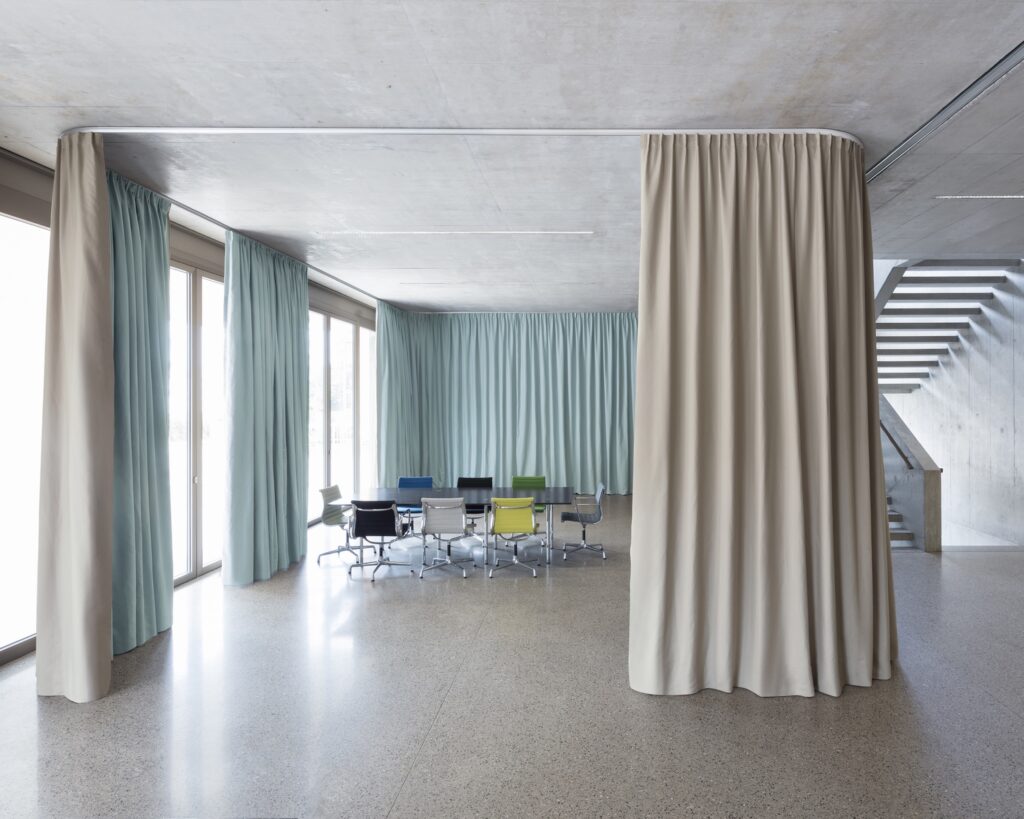
Warm metallic color schemes connect emotional warmth with perceived durability. Yellow hues — from soft butter to deep ochre — bring energy and optimism. Bronze and brass tones add depth, reflective highlights, and a handcrafted or vintage feel. Together, the yellow and bronze palette balances brightness with grounding metallic texture, working across textiles, paint, metal finishes, and digital color systems.
yellow and bronze palette: core principles
1. Balance temperature and value
Select yellow tones with a similar color temperature to the bronze finish. Cool lemon yellows clash with warmer bronzes; opt for warm yellows (amber, ochre) to harmonize. Use value contrast — light yellow walls with mid-tone bronze fixtures or darker yellow accents with brighter bronzes — to create depth.
2. Mix finishes and textures
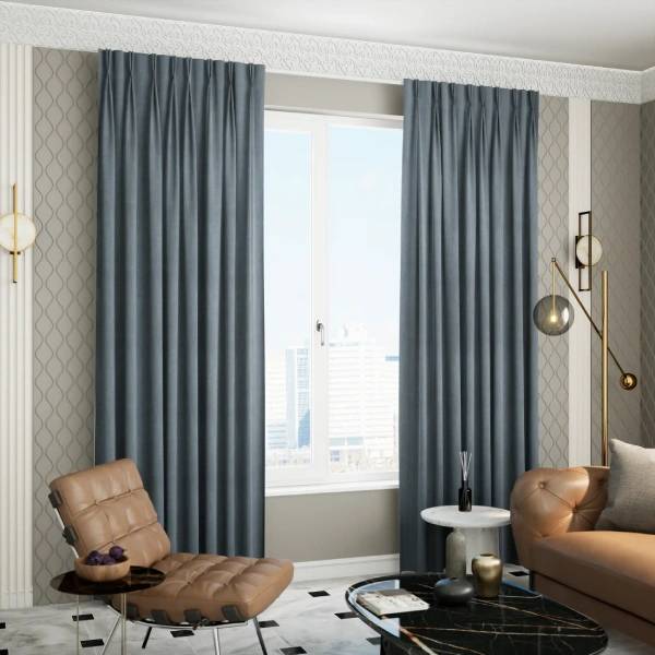
Contrast matte yellow surfaces (paint, textiles) with satin or aged bronze metalwork. Brushed, oxidized, and polished bronze finishes read differently under light; test samples in the target environment. Textures like woven linens, patinated metals, and matte ceramics enhance the palette's tactile appeal.
3. Use neutrals as anchors
Introduce neutral bases — warm greige, charcoal, or deep browns — to ground the brightness. White or cream can lift the scheme but choose warm whites to avoid a sterile look.
BRONZE framework for choosing and applying colors
Use the BRONZE framework as a quick checklist when planning a scheme.
- Balance: establish light, mid, and dark values
- Reflectivity: decide which elements are metallic vs. matte
- Origin: pick a dominant yellow family (amber, ochre, mustard)
- Neutral anchors: add 1–2 neutral grounding tones
- Zoning: allocate palette roles (walls, accents, hardware)
- Experiment: test large samples under real lighting
Short real-world example
Scenario: A boutique café wants a warm, vintage-modern look. Apply the BRONZE framework: choose a warm ochre wall color (dominant yellow), install brushed bronze light fixtures and cabinet hardware (metallic accents), use deep walnut counters as a neutral anchor, and add mustard-cushioned seating for mid-value contrast. Test paint and metal samples by day and night to confirm consistency.
Practical tips for interiors, print, and digital use
- Compare physical samples: For paint and metals, view swatches together under the room’s lighting. For brand colors, request printed proofs or calibrated screen tests.
- Specify finishes: Note exact metal finishes (e.g., satin bronze, aged brass) and use consistent terminology in procurement documents.
- Adjust saturation for scale: Large surfaces suit desaturated yellows; saturated accents work for pillows, signage, or icons.
- Mind accessibility: Ensure sufficient contrast between text and background when using yellow in digital interfaces; use contrast-checking tools aligned with WCAG guidelines.
Trade-offs and common mistakes
Common mistakes
- Using high-gloss bronze with delicate yellows creates glare and can overwhelm small spaces.
- Choosing mismatched temperature: pairing cool yellows with warm bronze finishes often looks discordant.
- Over-saturating an entire space in strong yellow leads to fatigue; reserve intense hues for focal points.
Trade-offs to consider
Durability vs. patina: polished bronze looks contemporary but shows fingerprints; aged patina hides wear but varies batch-to-batch. Warmth vs. brightness: more yellow increases perceived warmth but reduces perceived elegance if not balanced with rich neutrals and textured metals.
Core cluster questions
- How to pair yellow shades with bronze finishes?
- What neutrals work best with warm metallic palettes?
- How to test color samples for lighting variations?
- How to apply a yellow and bronze palette in branding vs. interiors?
- What textures complement bronze in modern designs?
Standards and color matching
For accurate color communication, reference a standardized color system when specifying hues and metals. For exact color matching and specification, consult a recognized color system such as Pantone's guides for print and materials testing Pantone. For accessibility, follow the Web Content Accessibility Guidelines (WCAG) when applying yellows in digital text or UI elements.
Practical checklist before committing to a palette
- Gather real material samples (paint, metal, fabric).
- View samples in the intended lighting conditions and at different times of day.
- Create a mood mockup (photo edit or physical board) showing proposed placement of yellows and bronzes.
- Check accessibility contrast for text and UI elements.
- Confirm procurement details: finish names, supplier samples, and warranty on metal finishes.
Final notes
A yellow and bronze palette can deliver a versatile visual language — from sunny and approachable to refined and vintage — when selected and tested thoughtfully. Rely on the BRONZE framework and the checklist above to make decisions that hold up under real-world conditions.
Frequently asked questions
What makes a yellow and bronze palette timeless?
The combination pairs warm, energetic color with metallic depth. Bronze provides tactile, aging qualities while yellow supplies light and optimism. When balanced with neutral anchors and varied textures, the result feels both classic and adaptable across trends.
How can a yellow and bronze palette be made accessible in digital design?
Use sufficient contrast ratios for text and interactive elements. Test colors with WCAG contrast tools and provide alternate high-contrast modes or overlays where necessary.
Which yellow shades typically pair best with bronze finishes?
Warm yellows such as ochre, mustard, amber, and muted gold generally harmonize with bronze. Desaturated yellows scale better for walls; richer yellows work as accent colors.
Can a yellow and bronze palette work in small spaces?
Yes — use bronze for small but impactful fixtures and keep yellow tones light or muted on large planes. Introduce dark neutrals sparingly to add depth without closing in the space.
How to test which bronze finish fits a project?
Request physical finish samples and install mockups where possible. Observe finishes under the actual lighting to evaluate reflectivity and warmth; document manufacturer finish names for procurement.